การเพิ่มปุ่มแบบกำหนดเองใน Android


131

ฉันพยายามรับผล radiobutton สำหรับปุ่มปกติใน Android

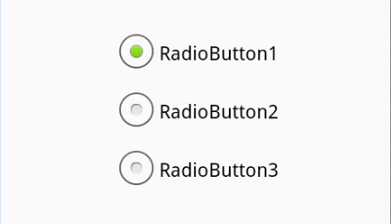
ฉันมีปุ่มตัวเลือกแบบง่ายด้านล่าง

ป้อนคำอธิบายรูปภาพที่นี่

รหัสสำหรับสิ่งนี้คือ ::

activity_main.xml

<RelativeLayout xmlns:android="http://schemas.android.com/apk/res/android"
    xmlns:tools="http://schemas.android.com/tools"
    android:layout_width="match_parent"
    android:layout_height="match_parent"
    android:paddingBottom="@dimen/activity_vertical_margin"
    android:paddingLeft="@dimen/activity_horizontal_margin"
    android:paddingRight="@dimen/activity_horizontal_margin"
    android:paddingTop="@dimen/activity_vertical_margin"
    tools:context=".MainActivity" >

    <RadioGroup
        android:id="@+id/radioGroup1"
        android:layout_width="wrap_content"
        android:layout_height="wrap_content"
        android:layout_centerHorizontal="true"
        android:layout_centerVertical="true" >

        <RadioButton
            android:id="@+id/radio0"
            android:layout_width="wrap_content"
            android:layout_height="wrap_content"
            android:checked="true"
            android:text="RadioButton1" />

        <RadioButton
            android:id="@+id/radio1"
            android:layout_width="wrap_content"
            android:layout_height="wrap_content"
            android:text="RadioButton2" />

        <RadioButton
            android:id="@+id/radio2"
            android:layout_width="wrap_content"
            android:layout_height="wrap_content"
            android:text="RadioButton3" />
    </RadioGroup>


</RelativeLayout>

วิธีการปรับแต่งดังต่อไปนี้ ::

ป้อนคำอธิบายรูปภาพที่นี่

ขอบคุณมาก !

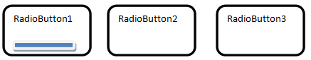
[แก้ไข] โดยใช้รหัสจากหนึ่งในคำตอบ

ป้อนคำอธิบายรูปภาพที่นี่

แต่ชื่อปุ่มถูกบดบังด้วยตัวเลือกการเลือกว่าจะลบมันได้อย่างไร?


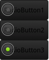
{EDIT} การเปลี่ยนแปลงเพิ่มเติม

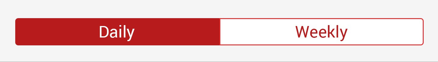
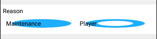
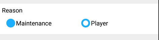
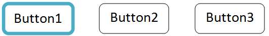
การเปลี่ยนแปลงครั้งสุดท้ายควรอย่างน้อยฉันควรรู้ว่าฉันเลือกปุ่มใดจากปุ่มตัวเลือกสามปุ่ม .... เป็นไปได้ไหมที่จะได้รับด้านล่าง?

ป้อนคำอธิบายรูปภาพที่นี่


4
4 ปีต่อมาฮ่า ๆ ๆ - นี่อาจเป็นประโยชน์สำหรับคุณcrosp.net/blog/android/ ......
คนอยู่ที่ไหนสักแห่ง

1
@SomeoneSomewhere ..... ฮ่าฮ่าฮ่า ... ขอบคุณ ... มันเป็นประโยชน์ :) :)
Devrath

คำตอบ:


246

เพิ่ม drawable พื้นหลังที่อ้างอิงถึงรูปภาพหรือตัวเลือก (เช่นด้านล่าง) และทำให้ปุ่มโปร่งใส:

<RadioButton
    android:id="@+id/radio0"
    android:layout_width="wrap_content"
    android:layout_height="wrap_content"
    android:background="@null"
    android:button="@drawable/yourbuttonbackground"
    android:checked="true"
    android:text="RadioButton1" />

หากคุณต้องการให้ปุ่มตัวเลือกของคุณมีทรัพยากรอื่นเมื่อทำเครื่องหมายเลือกสร้างพื้นหลังตัวเลือก drawable:

ความละเอียด / drawable / yourbuttonbackground.xml

<selector xmlns:android="http://schemas.android.com/apk/res/android" >
    <item
        android:drawable="@drawable/b"
        android:state_checked="true"
        android:state_pressed="true" />
    <item
        android:drawable="@drawable/a"
        android:state_pressed="true" />
    <item
        android:drawable="@drawable/a"
        android:state_checked="true" />
    <item
        android:drawable="@drawable/b" />
</selector>

ในตัวเลือกด้านบนเราอ้างอิงสอง drawable aและbนี่คือวิธีที่เราสร้าง:

res / drawable / a.xml - สถานะที่เลือก

<shape
    xmlns:android="http://schemas.android.com/apk/res/android"
    android:shape="rectangle" >
    <corners
        android:radius="5dp" />
    <solid
        android:color="#fff" />
    <stroke
        android:width="2dp"
        android:color="#53aade" />
</shape>

res / drawable / b.xml - สถานะปกติ

<shape
    xmlns:android="http://schemas.android.com/apk/res/android"
    android:shape="rectangle" >
    <corners
        android:radius="5dp" />
    <solid
        android:color="#fff" />
    <stroke
        android:width="2dp"
        android:color="#555555" />
</shape>

เพิ่มเติมเกี่ยวกับ drawables ที่นี่: http://developer.android.com/guide/topics/resources/drawable-resource.html


1
เฮ้ขอบคุณฉันได้ทำงานเสร็จแล้ว ... แต่ชื่อปุ่มจะถูกเขียนทับโดยตัวเลือกเลือก ..... วิธีการลบที่ ... ทำให้การทำงานเหมือนเดิม .... ทั้งหมดที่ฉันพยายามที่จะบรรลุเป็นฉัน แสดงให้เห็นในคำถามของฉัน ... ทิศทางเพิ่มเติมใด ๆ ! [หมายเหตุ :: โปรดดูคำถามล่าสุด]
Devrath

2
@Unicorn เพิ่มandroid:button="@android:color/transparent"เพื่อลบ
Evan Bashir

3
@ ยูนิคอร์นใช่ฉันเข้าใจ สิ่งที่คุณต้องทำคือสร้างตัวเลือก drawable เช่นฉันระบุไว้ในคำตอบของฉัน คุณจะสร้างสอง drawable หนึ่งปุ่มสำหรับสไตล์ปุ่มปกติและอีกปุ่มหนึ่งสำหรับสไตล์ปุ่มกด ฉันจะอัปเดตคำตอบของฉันด้วยรหัสสำหรับ drawable เหล่านี้
Evan Bashir

1
เพื่อให้พอดีกับข้อความแทนที่จะทับซ้อนกันให้ตั้งค่าปุ่ม drawable ไม่ใช่พื้นหลังและตรวจสอบให้แน่ใจว่าเป็น 9-patch ที่มีจุดยืดและพื้นที่เนื้อหาที่ระบุให้พอดีกับข้อความ
Lance Nanek

3
พฤติกรรมปกติสำหรับ RadioButton คุณกำลังมองหาช่องทำเครื่องหมาย?
Vincent D.

49

ฉันได้อัปเดตคำตอบที่ยอมรับแล้วและนำสิ่งที่ไม่จำเป็นออก

ฉันสร้าง XML สำหรับภาพต่อไปนี้

ป้อนคำอธิบายรูปภาพที่นี่

รหัสXMLของคุณRadioButtonคือ:

<RadioGroup
        android:id="@+id/daily_weekly_button_view"
        android:layout_width="match_parent"
        android:layout_height="wrap_content"
        android:layout_marginStart="8dp"
        android:layout_marginLeft="8dp"
        android:layout_marginTop="8dp"
        android:layout_marginEnd="8dp"
        android:layout_marginRight="8dp"
        android:gravity="center_horizontal"
        android:orientation="horizontal"
        app:layout_constraintEnd_toEndOf="parent"
        app:layout_constraintStart_toStartOf="parent"
        app:layout_constraintTop_toTopOf="parent">


        <RadioButton
            android:id="@+id/radio0"
            android:layout_width="@dimen/_80sdp"
            android:gravity="center"
            android:layout_height="wrap_content"
            android:background="@drawable/radio_flat_selector"
            android:button="@android:color/transparent"
            android:checked="true"
            android:paddingLeft="@dimen/_16sdp"
            android:paddingTop="@dimen/_3sdp"
            android:paddingRight="@dimen/_16sdp"
            android:paddingBottom="@dimen/_3sdp"
            android:text="Daily"
            android:textColor="@color/radio_flat_text_selector" />

        <RadioButton
            android:id="@+id/radio1"
            android:gravity="center"
            android:layout_width="@dimen/_80sdp"
            android:layout_height="wrap_content"
            android:background="@drawable/radio_flat_selector"
            android:button="@android:color/transparent"
            android:paddingLeft="@dimen/_16sdp"
            android:paddingTop="@dimen/_3sdp"
            android:paddingRight="@dimen/_16sdp"
            android:paddingBottom="@dimen/_3sdp"
            android:text="Weekly"
            android:textColor="@color/radio_flat_text_selector" />

</RadioGroup>

radio_flat_selector.xml สำหรับตัวเลือกพื้นหลัง:

<?xml version="1.0" encoding="utf-8"?>
<selector xmlns:android="http://schemas.android.com/apk/res/android">
    <item android:drawable="@drawable/radio_flat_selected" android:state_checked="true" />
    <item android:drawable="@drawable/radio_flat_regular" />
</selector>

radio_flat_selected.xml สำหรับปุ่มที่เลือก:

<?xml version="1.0" encoding="utf-8"?>
<shape xmlns:android="http://schemas.android.com/apk/res/android"
    android:shape="rectangle">
    <corners
        android:radius="1dp"
        />
    <solid android:color="@color/colorAccent" />
    <stroke
        android:width="1dp"
        android:color="@color/colorAccent" />
</shape>

radio_flat_regular.xml สำหรับตัวเลือกปกติ:

<?xml version="1.0" encoding="utf-8"?>
<shape xmlns:android="http://schemas.android.com/apk/res/android"
    android:shape="rectangle">
    <corners android:radius="1dp" />
    <solid android:color="#fff" />
    <stroke
        android:width="1dp"
        android:color="@color/colorAccent" />
</shape>

รหัสไฟล์ 3 ทั้งหมดข้างต้นจะอยู่ในdrawable/โฟลเดอร์

ตอนนี้เรายังต้องการTextColor Selector เพื่อเปลี่ยนสีของข้อความตาม

radio_flat_text_selector.xml สำหรับตัวเลือกสีข้อความ

(ใช้color/โฟลเดอร์สำหรับไฟล์นี้)

<?xml version="1.0" encoding="utf-8"?>
<selector xmlns:android="http://schemas.android.com/apk/res/android">
    <item android:color="@color/colorAccent" android:state_checked="false" />
    <item android:color="@color/colorWhite" android:state_checked="true" />
</selector>

หมายเหตุ: ฉันได้รับคำตอบจำนวนมากสำหรับโซลูชันประเภทนี้ แต่ไม่พบวิธีแก้ปัญหาที่ดีดังนั้นฉันจึงทำ

หวังว่ามันจะเป็นประโยชน์กับคุณ

ขอบคุณ


ฉันใกล้เคียงกับสิ่งที่ฉันต้องการจริงๆ แต่ฉันเห็นรัศมีมุมระหว่างรายการด้วย เมื่อฉันมีสามปุ่มฉันจะได้รับสิ่งนี้ มีวิธีใดบ้างที่จะตรวจสอบให้แน่ใจว่ารัศมีใช้กับกลุ่มเท่านั้น? imgur.com/mP8dtKR
AdamMc331

1
@ AdamMc331 คุณจะต้องสร้างตัวเลือก 3 ตัวหนึ่งตัวสำหรับปุ่มที่จุดเริ่มต้นของแถวหนึ่งตัวสำหรับอยู่ตรงกลางและอีกอันหนึ่งสำหรับอันสุดท้ายคุณสามารถปรับและมีมุมที่โค้งมนอันใดอันหนึ่งของ ขอบและซ่อนหนึ่งในนั้นด้วยการทำเครื่องหมายเชิงลบหากคุณใส่ <shape> ภายใน <item> thats ภายใน <layer-list>
Benny

ฉันจะสร้างสี / โฟลเดอร์ได้อย่างไร คุณช่วยฉันได้ไหม
Kamrujjaman Joy

ใช่มันจะทำงาน แจ้งให้เราทราบหากคุณพบปัญหาใด ๆ
Pratik Butani

ฉันลองบน Android 4 และได้รับibb.co/jyHVXHSนี้กับกิจกรรม Appcompat แต่ทำงานได้ดีเมื่อฉันขยายด้วยกิจกรรม
kartoos khan

42

ใช้รูปแบบไฟล์ XML เดียวกันจากคำตอบของ Evan แต่ไฟล์หนึ่งไฟล์ที่วาดได้คือสิ่งที่คุณต้องการสำหรับการจัดรูปแบบ

<RadioButton
    android:id="@+id/radio0"
    android:layout_width="wrap_content"
    android:layout_height="wrap_content"
    android:background="@drawable/custom_button_background"
    android:button="@android:color/transparent"
    android:checked="true"
    android:text="RadioButton1" />

และไฟล์ที่สามารถถอดแยกได้ของคุณ:

<?xml version="1.0" encoding="utf-8"?>
<selector xmlns:android="http://schemas.android.com/apk/res/android" >

    <item android:state_pressed="true" >
         <shape android:shape="rectangle" >
             <corners android:radius="3dip" />
             <stroke android:width="1dip" android:color="#333333" />
             <solid android:color="#cccccc" />            
         </shape>
    </item>

    <item android:state_checked="true">
         <shape android:shape="rectangle" >
             <corners android:radius="3dip" />
             <stroke android:width="1dip" android:color="#333333" />
             <solid android:color="#cccccc" /> 
         </shape>
    </item>  

    <item>
         <shape android:shape="rectangle"  >
             <corners android:radius="3dip" />
             <stroke android:width="1dip" android:color="#cccccc" />
             <solid android:color="#ffffff" />            
         </shape>
    </item>
</selector>

1
ขอบคุณสำหรับสิ่งนี้ ... มันมีประโยชน์ ยังคงพยายามทดลองใช้ ชื่อของ drawable, customButtonBackground ไม่ได้รับอนุญาตให้พิมพ์ใหญ่ - อย่างน้อยนั่นคือสิ่งที่ Android Studio บอกฉัน
LarsH

10

การตั้งค่าandroid:backgroundและandroid:buttonRadioButton เหมือนคำตอบที่ยอมรับไม่ได้สำหรับฉัน ภาพที่วาดได้ถูกแสดงเป็นพื้นหลัง (แม้ว่าจะandroid:buttonถูกกำหนดเป็นโปร่งใส) ไปยังข้อความของปุ่มตัวเลือกเป็นป้อนคำอธิบายรูปภาพที่นี่

android:background="@drawable/radiobuttonstyle"
    android:button="@android:color/transparent"

ให้ radiobutton เป็น radiobuttonstyle.xml แบบกำหนดเองได้

<RadioButton
    android:layout_width="wrap_content"
    android:layout_height="wrap_content"
    android:checked="true"
    android:text="Maintenance"
    android:id="@+id/radioButton1"
    android:button="@drawable/radiobuttonstyle"
      />

และ radiobuttonstyle.xml มีดังนี้

<?xml version="1.0" encoding="utf-8" ?>
<selector xmlns:android="http://schemas.android.com/apk/res/android">
  <item android:state_checked="true" android:drawable="@drawable/ic_radio_checked"></item>
  <item android:state_checked="false" android:drawable="@drawable/ic_radio_unchecked"></item>
</selector>

และหลังจาก radiobutton นี้ด้วยรูปแบบปุ่มที่กำหนดเองทำงาน

ป้อนคำอธิบายรูปภาพที่นี่


8

คุณต้องเติมแอตทริบิวต์ "ปุ่ม" ของคลาส "CompoundButton" ด้วยเส้นทางแบบลากได้ XML ( my_checkbox ) ใน XML drawable คุณต้องมี:

<?xml version="1.0" encoding="utf-8"?>
<selector xmlns:android="http://schemas.android.com/apk/res/android" >
    <item android:state_checked="false" android:drawable="@drawable/checkbox_not_checked" />
     <item android:state_checked="true" android:drawable="@drawable/checkbox_checked" />
     <item android:drawable="@drawable/checkbox_not_checked" /> <!-- default -->
</selector>

อย่าลืมที่จะแทนที่my_checkboxด้วยชื่อไฟล์ของคุณในช่องทำเครื่องหมาย drawable, checkbox_not_checked PNG ของคุณซึ่งเป็นช่องทำเครื่องหมายของคุณเมื่อไม่ได้ตรวจสอบและcheckbox_checkedภาพของคุณเมื่อทำการตรวจสอบ

สำหรับขนาดอัพเดตพารามิเตอร์โครงร่างโดยตรง


1
ฉันเชื่อว่า OP ต้องการข้อความภายในปุ่ม ฉันคิดว่าวิธีเดียวที่จะทำเช่นนั้นคือนำไปใช้กับ drawable กับandroid:backgroundvs the android:button; จากนั้นประกาศandroid:buttonความโปร่งใส วิธีนี้ข้อความสามารถนั่งภายในปุ่ม
Evan Bashir

5

เพื่อซ่อนปุ่มตัวเลือกเริ่มต้นฉันขอแนะนำให้ลบปุ่มออกแทนที่จะทำให้มันโปร่งใสเนื่องจากข้อเสนอแนะแบบเห็นภาพทั้งหมดได้รับการจัดการโดยพื้นหลังที่สามารถถอดได้ :

android:button="@null"

นอกจากนี้ควรใช้สไตล์ให้ดีกว่าเนื่องจากมีปุ่มตัวเลือกหลายตัว:

<RadioButton style="@style/RadioButtonStyle" ... />

<style name="RadioButtonStyle" parent="@android:style/Widget.CompoundButton">
    <item name="android:background">@drawable/customButtonBackground</item>
    <item name="android:button">@null</item>
</style>

คุณจะต้องdrawable Seslyn customButtonBackgroundเกินไป


4

วิธีที่ดีที่สุดในการเพิ่ม drawable ที่กำหนดเองคือ:

 <RadioButton
                                android:id="@+id/radiocar"
                                android:layout_width="wrap_content"
                                android:layout_height="wrap_content"
                                android:layout_gravity="center"
                                android:background="@android:color/transparent"
                                android:button="@drawable/yourbuttonbackground"
                                android:checked="true"
                                android:drawableRight="@mipmap/car"
                                android:paddingLeft="5dp"
                                android:paddingRight="5dp"
                                android:text="yourtexthere"/>

การซ้อนทับเงาโดย drawable ที่กำหนดเองจะถูกลบที่นี่


ขอบคุณ @Abhilasha
varotariya vajsi

ฉันเลือกตัวเลือกนี้เช่นbackgroundกัน หากคุณตั้งค่าพื้นหลังคุณไม่สามารถเพิ่มข้อความลงใน RadioButton และจำเป็นต้องวาง TextView ของคุณเอง
voghDev

3

ลองวิธีนี้ง่ายๆ

  1. สร้างเค้าโครงใหม่ในโฟลเดอร์ drawable และตั้งชื่อ custom_radiobutton (คุณสามารถเปลี่ยนชื่อได้ด้วย)

     <?xml version="1.0" encoding="utf-8"?>
      <selector xmlns:android="http://schemas.android.com/apk/res/android" >
     <item android:state_checked="false" 
    android:drawable="@drawable/your_radio_off_image_name" />
     <item android:state_checked="true" 
    android:drawable="@drawable/your_radio_on_image_name" />
    </selector>
  2. ใช้สิ่งนี้ในกิจกรรมการออกแบบของคุณ

    <RadioButton
     android:id="@+id/radiobutton"
     android:layout_width="wrap_content"
     android:layout_height="wrap_content"
     android:button="@drawable/custom_radiobutton"/>

1

โค้ดด้านล่างคือตัวอย่างของปุ่มตัวเลือกที่กำหนดเอง ทำตามขั้นตอนด้านล่าง ..

  1. ไฟล์ Xml

                        <FrameLayout
                            android:layout_width="0dp"
                            android:layout_height="match_parent"
                            android:layout_weight="0.5">
    
    
                            <TextView
                                android:id="@+id/text_gender"
                                android:layout_width="wrap_content"
                                android:layout_height="wrap_content"
                                android:layout_gravity="left|center_vertical"
                                android:gravity="center"
                                android:text="@string/gender"
                                android:textColor="#263238"
                                android:textSize="15sp"
                                android:textStyle="normal"
    
                                />
    
                            <TextView
                                android:id="@+id/text_male"
                                android:layout_width="wrap_content"
                                android:layout_height="wrap_content"
                                android:layout_gravity="center"
                                android:layout_marginLeft="10dp"
                                android:gravity="center"
                                android:text="@string/male"
                                android:textColor="#263238"
                                android:textSize="15sp"
                                android:textStyle="normal"/>
    
                            <RadioButton
                                android:id="@+id/radio_Male"
                                android:layout_width="28dp"
                                android:layout_height="28dp"
                                android:layout_gravity="right|center_vertical"
                                android:layout_marginRight="4dp"
                                android:button="@drawable/custom_radio_button"
                                android:checked="true"
                                android:text=""
                                android:onClick="onButtonClicked"
                                android:textSize="15sp"
                                android:textStyle="normal"
    
                                />
                        </FrameLayout>
    
                        <FrameLayout
                            android:layout_width="0dp"
                            android:layout_height="match_parent"
                            android:layout_weight="0.6">
    
                            <RadioButton
                                android:id="@+id/radio_Female"
                                android:layout_width="28dp"
                                android:layout_height="28dp"
                                android:layout_gravity="right|center_vertical"
                                android:layout_marginLeft="10dp"
                                android:layout_marginRight="0dp"
                                android:button="@drawable/custom_female_button"
                                android:text=""
                                android:onClick="onButtonClicked"
                                android:textSize="15sp"
                                android:textStyle="normal"/>
    
                            <TextView
                                android:id="@+id/text_female"
                                android:layout_width="wrap_content"
                                android:layout_height="wrap_content"
                                android:layout_gravity="left|center_vertical"
                                android:gravity="center"
                                android:text="@string/female"
                                android:textColor="#263238"
                                android:textSize="15sp"
                                android:textStyle="normal"/>
    
                            <RadioButton
                                android:id="@+id/radio_Other"
                                android:layout_width="28dp"
                                android:layout_height="28dp"
                                android:layout_gravity="center_horizontal|bottom"
                                android:layout_marginRight="10dp"
                                android:button="@drawable/custom_other_button"
                                android:text=""
                                android:onClick="onButtonClicked"
                                android:textSize="15sp"
                                android:textStyle="normal"/>
    
                            <TextView
                                android:id="@+id/text_other"
                                android:layout_width="wrap_content"
                                android:layout_height="wrap_content"
                                android:layout_gravity="right|center_vertical"
                                android:layout_marginRight="34dp"
                                android:gravity="center"
                                android:text="@string/other"
                                android:textColor="#263238"
                                android:textSize="15sp"
                                android:textStyle="normal"/>
                        </FrameLayout>
                    </LinearLayout>

    2. เพิ่ม xml ที่กำหนดเองสำหรับปุ่มตัวเลือก

    2.1. drawable อื่น ๆ

    custom_other_button.xml

    <item android:state_checked="true" android:drawable="@drawable/select_radio_other" />
    <item android:state_checked="false" android:drawable="@drawable/default_radio" />

    2.2. หญิง drawable

    custom_female_button.xml

    <item android:state_checked="true" android:drawable="@drawable/select_radio_female" />
    <item android:state_checked="false" android:drawable="@drawable/default_radio" />

    2.3 drawable ชาย

    custom_radio_button.xml

    <item android:state_checked="true" android:drawable="@drawable/select_radio_male" />
    <item android:state_checked="false" android:drawable="@drawable/default_radio" />

    1. เอาท์พุท: นี่คือหน้าจอเอาท์พุท

0

ฉันรู้ว่านี่เป็นคำตอบที่ล่าช้า แต่เมื่อดูผ่าน developer.android.com ดูเหมือนว่าปุ่ม Toggle จะเหมาะสำหรับสถานการณ์ของคุณ

รูปปุ่มสลับ http://developer.android.com/guide/topics/ui/controls/togglebutton.html

และแน่นอนคุณยังคงสามารถใช้คำแนะนำอื่น ๆ เพื่อให้สามารถวาดพื้นหลังเพื่อให้ได้รูปลักษณ์ที่คุณต้องการ

<ToggleButton 
    android:id="@+id/togglebutton"
    android:layout_width="wrap_content"
    android:layout_height="wrap_content"
    android:background="@drawable/custom_button_background"
    android:textOn="On"
    android:textOff="Off"
    />

ตอนนี้ถ้าคุณต้องการแก้ไขครั้งสุดท้ายและมีลักษณะพิเศษ "รัศมี" รอบ ๆ ปุ่มของคุณคุณสามารถใช้ตัวเลือกกำหนดเองอื่นเพื่อทำเช่นนั้น

<?xml version="1.0" encoding="utf-8"?>
<selector xmlns:android="http://schemas.android.com/apk/res/android">
    <item android:state_selected="true" > <!-- selected -->
        <shape>
            <solid
                android:color="@android:color/white" />
            <stroke
                android:width="3px"
                android:color="@android:color/holo_blue_bright" />
            <corners
                android:radius="5dp" />
        </shape>
    </item>
    <item> <!-- default -->
        <shape>
            <solid
                android:color="@android:color/white" />
            <stroke
                android:width="1px"
                android:color="@android:color/darker_gray" />
            <corners
                android:radius="5dp" />
        </shape>
    </item> 
</selector>

สิ่งนี้จะยังคงอนุญาตให้มีการทำงานของปุ่มตัวเลือกหรือไม่เมื่อเลือกปุ่มเดียว
LarsH
โดยการใช้ไซต์ของเรา หมายความว่าคุณได้อ่านและทำความเข้าใจนโยบายคุกกี้และนโยบายความเป็นส่วนตัวของเราแล้ว
Licensed under cc by-sa 3.0 with attribution required.