ปุ่มระบายสีใน Android ที่มีการออกแบบวัสดุและ AppCompat


256

ก่อนที่การAppCompatอัปเดตจะออกมาในวันนี้ฉันสามารถเปลี่ยนสีของปุ่มต่างๆใน Android L ได้ แต่ไม่ใช่รุ่นเก่ากว่า หลังจากรวมการอัปเดต AppCompat ใหม่แล้วฉันไม่สามารถเปลี่ยนสีสำหรับรุ่นใดรุ่นหนึ่งได้เมื่อฉันลองใช้งานปุ่มจะหายไป ไม่มีใครรู้วิธีเปลี่ยนสีปุ่ม?

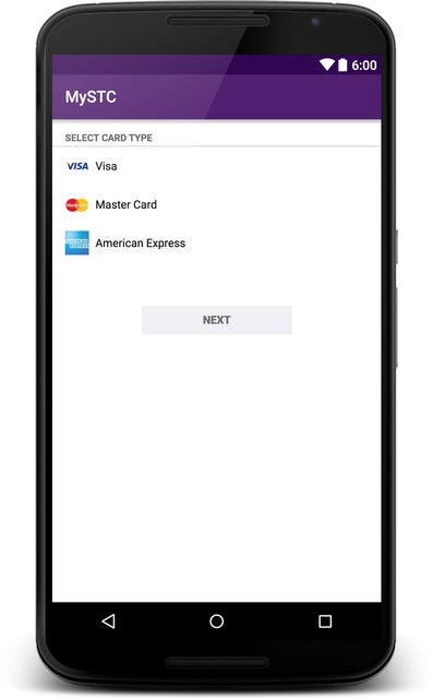
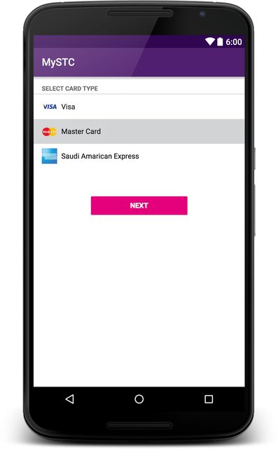
ภาพต่อไปนี้แสดงสิ่งที่ฉันต้องการบรรลุ:

ภาพแสดงผลลัพธ์ที่ต้องการ

ปุ่มสีขาวเป็นค่าเริ่มต้นปุ่มสีแดงเป็นสิ่งที่ฉันต้องการ

นี่คือสิ่งที่ฉันทำก่อนหน้านี้เพื่อเปลี่ยนสีของปุ่มในstyles.xml:

<item name="android:colorButtonNormal">insert color here</item>

และจะทำแบบไดนามิก:

button.getBackground().setColorFilter(getResources().getColor(insert color here), PorterDuff.Mode.MULTIPLY);

นอกจากนี้ฉันเปลี่ยนชุดรูปแบบของแม่จาก@android:style/Theme.Material.Light.DarkActionBarเป็นTheme.AppCompat.Light.DarkActionBar


ฉันลองเหมือนกัน แต่ไม่มีอะไรเปลี่ยนสีของปุ่ม ฉันยังเอาออกหุ่นยนต์: จากแอตทริบิวต์ becouse มันเป็นจาก lib สนับสนุนและไม่ได้เป็นส่วนหนึ่งของหุ่นยนต์ namespace
Informatic0re

หากคุณใช้ android: colorButtonNormal กับ Android 5.0 ใช้งานได้ แต่ดูเหมือนจะไม่เข้ากันได้ย้อนหลัง
Informatic0re

ใช่นั่นคือสิ่งที่ฉันกำลังประสบอยู่
mail929

ฉันคิดด้วยว่าสีที่ถูกเน้นนั้นไม่เปลี่ยนสีของช่องทำเครื่องหมาย แต่มันเปลี่ยนเป็นสีที่เก่ากว่า
Informatic0re

บวกหนึ่งสำหรับวิธีแบบไดนามิกนั้น :)
theapache64

คำตอบ:


222

แก้ไขอย่างเป็นทางการใน Support Library rev.22 (ศุกร์ 13 มีนาคม 2558) ดูปัญหารหัส Google ที่เกี่ยวข้อง:

https://issuetracker.google.com/issues/37008632

ตัวอย่างการใช้งาน

theme.xml:

<item name="colorButtonNormal">@color/button_color</item>

V21 / theme.xml

<item name="android:colorButtonNormal">@color/button_color</item>

17
มีตัวอย่างวิธีการใช้หรือไม่? ฉันจะตั้งค่าสีด้วยปุ่มเดียวได้อย่างไร
ซับซ้อน

3
@ WindowsRider ฉันมีปัญหา แต่ฉันต้องการใช้มันเพื่อสร้างปุ่มที่มีสีต่างกัน ฉันสร้างสไตล์ Button.Red, Button.Green ทั้งหมดกับพาเรนต์เท่ากับสไตล์ฐานของปุ่ม ฉันตั้งค่ารายการ colorButtonNormal เป็นสีที่ร้องขอตั้งค่านี้เป็นชุดรูปแบบปุ่ม น่าเสียดายที่มันมีเพียงปุ่มสีสำหรับ 21 ด้านล่างจะไม่แทนที่ colorButtonNormal ที่กำหนดไว้ในชุดรูปแบบ
dominik4142

71
ด้วย AppCompat 22.1.1 มันใช้งานได้กับฉันใน 2.3.7, 4.4.4 และ 5.1 สำหรับปุ่มเดียวเท่านั้น: การตั้งค่าปุ่ม android:theme="@style/ColoredButton"และใน styles.xml <style name="ColoredButton" parent="Widget.AppCompat.Button"> <item name="colorButtonNormal">@color/button_yellow</item> </style>
hunyadym

2
@hunyadym เพิ่มธีมให้กับตัวแบ่งปุ่ม onClick ด้วยเหตุผลบางประการ ฉันจะจำแนกสิ่งนี้เป็นวิธีแก้ปัญหาจนกว่าห้องสมุดการออกแบบให้วิธีที่ดีกว่า
gladed

3
@gladed: ดูเหมือนว่าในกรณีของคุณปัญหาคือข้อผิดพลาดนี้: code.google.com/p/android/issues/detail?id=62795#c1
hunyadym

148

แก้ไข (22.06.2016):

ไลบรารีAppcompatเริ่มให้การสนับสนุนปุ่มวัสดุหลังจากที่ฉันโพสต์คำตอบดั้งเดิม ในโพสต์นี้คุณสามารถเห็นการใช้งานปุ่มยกและแบนที่ง่ายที่สุด

คำตอบเดิม:

AppCompat นั้นไม่รองรับปุ่ม แต่คุณสามารถใช้ xml เป็นพื้นหลังได้ สำหรับการทำเช่นนั้นฉันได้ดูซอร์สโค้ดของ Android และพบไฟล์ที่เกี่ยวข้องสำหรับปุ่มจัดแต่งทรงผม

1 - ดูการใช้งานปุ่มวัสดุจากแหล่งต้นฉบับ

มีลักษณะที่เป็นbtn_default_material.xml ซอร์สโค้ดหุ่นยนต์

คุณสามารถคัดลอกไฟล์ลงในโฟลเดอร์โครงการ drawable-v21 แต่อย่าแตะต้องสีที่นี่ ไฟล์ที่คุณต้องการเปลี่ยนเป็นไฟล์ที่สอง

drawable-V21 / custom_btn.xml

<ripple xmlns:android="http://schemas.android.com/apk/res/android"
    android:color="?attr/colorControlHighlight">
    <item android:drawable="@drawable/btn_default_mtrl_shape" />
</ripple>

2 - รับรูปร่างของปุ่มวัสดุดั้งเดิม

เมื่อคุณรู้ว่ามีรูปร่างที่ใช้ภายใน drawable นี้ซึ่งคุณสามารถหาได้ในไฟล์ของซอร์สโค้ดนี้

<inset xmlns:android="http://schemas.android.com/apk/res/android"
   android:insetLeft="@dimen/button_inset_horizontal_material"
   android:insetTop="@dimen/button_inset_vertical_material"
   android:insetRight="@dimen/button_inset_horizontal_material"
   android:insetBottom="@dimen/button_inset_vertical_material">
<shape android:shape="rectangle">
    <corners android:radius="@dimen/control_corner_material" />
    <solid android:color="?attr/colorButtonNormal" />
    <padding android:left="@dimen/button_padding_horizontal_material"
             android:top="@dimen/button_padding_vertical_material"
             android:right="@dimen/button_padding_horizontal_material"
             android:bottom="@dimen/button_padding_vertical_material" />
</shape>

3 - รับขนาดของปุ่มวัสดุ

และในแฟ้มนี้คุณมีขนาดบางอย่างที่ใช้จากไฟล์ที่คุณสามารถหาที่นี่ คุณสามารถคัดลอกไฟล์ทั้งหมดและใส่ลงในโฟลเดอร์ค่าของคุณ นี่เป็นสิ่งสำคัญสำหรับการใช้ขนาดเดียวกัน (ที่ใช้ในปุ่มวัสดุ) กับปุ่มทั้งหมด

4 - สร้างไฟล์ drawable อื่นสำหรับเวอร์ชันเก่า

สำหรับเวอร์ชั่นเก่าคุณควรมี drawable อีกอันที่มีชื่อเดียวกัน ฉันกำลังวางไอเท็มแบบอินไลน์โดยตรงแทนที่จะอ้างอิง คุณอาจต้องการอ้างอิงพวกเขา แต่สิ่งที่สำคัญที่สุดคือขนาดดั้งเดิมของปุ่มวัสดุ

drawable / custom_btn.xml

    <?xml version="1.0" encoding="utf-8"?>
    <selector xmlns:android="http://schemas.android.com/apk/res/android">
    
    <!-- pressed state -->
    <item android:state_pressed="true">
        <inset xmlns:android="http://schemas.android.com/apk/res/android"
            android:insetLeft="@dimen/button_inset_horizontal_material"
            android:insetTop="@dimen/button_inset_vertical_material"
            android:insetRight="@dimen/button_inset_horizontal_material"
            android:insetBottom="@dimen/button_inset_vertical_material">
            <shape android:shape="rectangle">
                <corners android:radius="@dimen/control_corner_material" />
                <solid android:color="@color/PRESSED_STATE_COLOR" />
                <padding android:left="@dimen/button_padding_horizontal_material"
                    android:top="@dimen/button_padding_vertical_material"
                    android:right="@dimen/button_padding_horizontal_material"
                    android:bottom="@dimen/button_padding_vertical_material" />
            </shape>
        </inset>
    </item>
    
    <!-- focused state -->
    <item android:state_focused="true">
        <inset xmlns:android="http://schemas.android.com/apk/res/android"
            android:insetLeft="@dimen/button_inset_horizontal_material"
            android:insetTop="@dimen/button_inset_vertical_material"
            android:insetRight="@dimen/button_inset_horizontal_material"
            android:insetBottom="@dimen/button_inset_vertical_material">
            <shape android:shape="rectangle">
                <corners android:radius="@dimen/control_corner_material" />
                <solid android:color="@color/FOCUSED_STATE_COLOR" />
                <padding android:left="@dimen/button_padding_horizontal_material"
                    android:top="@dimen/button_padding_vertical_material"
                    android:right="@dimen/button_padding_horizontal_material"
                    android:bottom="@dimen/button_padding_vertical_material" />
            </shape>
        </inset>
    </item>
    
    <!-- normal state -->
    <item>
        <inset xmlns:android="http://schemas.android.com/apk/res/android"
            android:insetLeft="@dimen/button_inset_horizontal_material"
            android:insetTop="@dimen/button_inset_vertical_material"
            android:insetRight="@dimen/button_inset_horizontal_material"
            android:insetBottom="@dimen/button_inset_vertical_material">
            <shape android:shape="rectangle">
                <corners android:radius="@dimen/control_corner_material" />
                <solid android:color="@color/NORMAL_STATE_COLOR" />
                <padding android:left="@dimen/button_padding_horizontal_material"
                    android:top="@dimen/button_padding_vertical_material"
                    android:right="@dimen/button_padding_horizontal_material"
                    android:bottom="@dimen/button_padding_vertical_material" />
            </shape>
        </inset>
    </item>
</selector>

ผลลัพธ์

ปุ่มของคุณจะมีผลกระเพื่อมบนอุปกรณ์ Lollipop เวอร์ชั่นเก่าจะมีปุ่มเหมือนกันทุกประการยกเว้นเอฟเฟกต์คลื่นเล็ก ๆ แต่เนื่องจากคุณให้ drawable สำหรับสถานะที่แตกต่างกันพวกเขาจะตอบสนองต่อการสัมผัสเหตุการณ์ (เช่นเดิม)


4
ใช่แน่นอน หากคุณใช้พื้นหลังเดียวกันสำหรับปุ่มทั้งหมดและหากคุณไม่ต้องการเพิ่มสิ่งนี้ซ้ำแล้วซ้ำอีกให้กำหนดรูปแบบปุ่มใน styles.xml ของคุณ <style name = "ButtonStyle" parent = "android: Widget.Button"> < ชื่อรายการ = "หุ่นยนต์: พื้นหลัง"> @ drawable / custom_btn </ รายการ> </ style> และเพิ่มรูปแบบปุ่มในรูปแบบของคุณ <ชื่อรายการ = "หุ่นยนต์: buttonStyle"> @ สไตล์ / ButtonStyle </ item>
eluleci

1
ฉันจะเพิ่มระดับความสูงของปุ่มนี้ในวันที่ 21 ได้อย่างไร อย่างที่ฉันเข้าใจฉันควรเพิ่มรูปร่างใหม่ด้วยปุ่มเงาด้านล่าง แต่ที่ฉันควรใส่ไว้ตรงไหน?
xakz

7
น่ารำคาญมากที่ไม่รองรับกล่องนี้
Sam

39
ฉันเห็นด้วยกับคุณโดยสิ้นเชิง ปุ่มเป็นเครื่องมือที่ใช้ส่วนใหญ่ แต่ไม่รวมอยู่ในไลบรารีการสนับสนุนสำหรับวัสดุ ฉันสงสัยว่าพวกเขากำลังคิดอะไรอยู่
eluleci

1
นอกจากนี้การทำตามคำแนะนำของคุณดูเหมือนว่าพื้นหลังจะไม่ปรากฏเลย ...
JMRboosties

111

สิ่งนี้ได้รับการปรับปรุงใน v23.0.0 ของไลบรารี AppCompat ด้วยการเพิ่มชุดรูปแบบเพิ่มเติมรวมถึง

Widget.AppCompat.Button.Colored

ก่อนอื่นรวมถึงการพึ่งพา appCompat หากคุณยังไม่ได้ดำเนินการ

compile('com.android.support:appcompat-v7:23.0.0') {
    exclude group: 'com.google.android', module: 'support-v4'
}

ตอนนี้เนื่องจากคุณต้องใช้ v23 ของแอพที่ใช้ร่วมกันได้คุณจะต้องกำหนดเป้าหมาย SDK-v23 ด้วย!

    compileSdkVersion = 23
    targetSdkVersion = 23

ในตัวคุณ values/theme

<item name="android:buttonStyle">@style/BrandButtonStyle</item>

ในตัวคุณ values/style

<style name="BrandButtonStyle" parent="Widget.AppCompat.Button.Colored">
    <item name="colorButtonNormal">@color/yourButtonColor</item>
    <item name="android:textColor">@color/White</item>
</style>

ในตัวคุณ values-v21/style

<style name="BrandButtonStyle" parent="Widget.AppCompat.Button.Colored">
    <item name="android:colorButtonNormal">@color/yourButtonColor</item>
    <item name="android:textColor">@color/White</item>
</style>

เนื่องจากชุดรูปแบบปุ่มของคุณจะขึ้นอยู่กับWidget.AppCompat.Button.Coloredสีของตัวอักษรบนปุ่มเป็นสีขาวเริ่มต้น!

แต่ดูเหมือนว่ามีปัญหาเมื่อคุณปิดการใช้งานปุ่มปุ่มจะเปลี่ยนสีเป็นสีเทาอ่อน แต่สีข้อความจะยังคงเป็นสีขาว!

วิธีแก้ปัญหาสำหรับสิ่งนี้คือการกำหนดสีข้อความบนปุ่มเป็นสีขาวโดยเฉพาะ! อย่างที่ฉันทำในสไตล์ที่แสดงด้านบน

ตอนนี้คุณสามารถกำหนดปุ่มของคุณและให้ AppCompat ทำส่วนที่เหลือ :)

<Button
        android:layout_width="200dp"
        android:layout_height="48dp" />

สถานะคนพิการ สถานะคนพิการ

รัฐที่เปิดใช้งาน รัฐที่เปิดใช้งาน

แก้ไข:

เพื่อเพิ่ม <Button android:theme="@style/BrandButtonStyle"/>


19
นั่นเป็นวิธีที่ดีที่สุดที่จะทำตอนนี้! <Button android:theme="@style/BrandButtonStyle"/>นอกจากนี้คุณยังสามารถใช้รูปแบบที่ปุ่มของแต่ละบุคคลด้วย มันจะต้องมีthemeแอตทริบิวต์และไม่styleแอตทริบิวต์
mohlendo

7
@Muhammad Alfaifi คุณมีตัวอย่างโครงการหรือส่วนสำคัญสำหรับเรื่องนี้หรือไม่? เราได้สร้างโครงการที่สะอาดและไม่ได้ทำงาน: github.com/Bresiu/ThemeTest ในสีปุ่ม Lolipop ด้วยสีที่ถูกเน้นและบน API v16 ปุ่มจะยังคงเป็นสีเทา: i.imgur.com/EVwkpk2.png
Bresiu

4
สิ่งนี้ใช้ได้เฉพาะฉันเมื่อระบุแอตทริบิวต์ android: theme ฉันไม่สามารถรับสไตล์แอททริบิวต์ให้ฉันได้ด้วยแท็กปุ่ม
Ray Hunter

8
เมื่อใช้ v23.1 lib สิ่งนี้ทำงานไม่ถูกต้องจะแสดงสีที่เน้นเป็น bg ไม่ใช่สีที่กำหนดไว้เสมอเมื่อพยายามตั้งค่าให้เป็นธีมทั้งหมด
Patrick Favre

3
ปัญหาเดียวกันที่นี่ใน v23.1 ปุ่มปิดการใช้งานเป็นสีเดียวกับปุ่มเปิดใช้งาน น่าผิดหวังมาก ใครคิดออกนี้
AhmedW

63

ในห้องสมุดสนับสนุน Android 22.1.0 Google ทำให้Buttonทราบถึงสีอ่อน ดังนั้นอีกวิธีหนึ่งในการปรับแต่งสีพื้นหลังของปุ่มคือการใช้backgroundTintททริบิวต์

ตัวอย่างเช่น,

<Button
       android:id="@+id/add_remove_button"
       android:layout_width="wrap_content"
       android:layout_height="wrap_content"
       android:backgroundTint="@color/bg_remove_btn_default"
       android:textColor="@android:color/white"
       tools:text="Remove" />

1
ที่สุด! บล็อกโพสต์เกี่ยวกับการเปิดตัว 22.1: android-developers.blogspot.no/2015/04/…
GuillermoMP

5
เอกสารอธิบายว่า: "สิ่งนี้จะถูกใช้โดยอัตโนมัติเมื่อคุณใช้ปุ่มในเค้าโครงของคุณคุณจะต้องใช้คลาสนี้ด้วยตนเองเมื่อเขียนมุมมองที่กำหนดเอง" developer.android.com/reference/android/support/v7/widget/นี่หมายความว่าเราไม่จำเป็นต้องเปลี่ยนเลย์เอาต์และรหัส java ทั้งหมดของเราหรือไม่
Stephane

@ หมายเลขสมาชิกเราควรเปลี่ยนเค้าโครง chris.banes.me/2015/04/22/support-l ไลบรารี-v22-1-0
Anton Holovin

น่ากลัว! ตอนนี้มี AppCompatToggleButton ที่ให้คุณเปลี่ยนพื้นหลังของ ToggleButtons หรือไม่? บางทีฉันอาจจะสามารถขโมยรหัส ...
swooby

19
น่าเสียดายที่นี่ใช้ได้กับ API 21+ เท่านั้น คุณลักษณะ android: backgroundTint ไม่ทำงานบน pre-Lollipop แม้กับ AppCompat library colorButtonNormal เท่านั้นจากชุดรูปแบบทำงานบน pre-Lollipop
Timur_C

42

หากต้องการสนับสนุนปุ่มสีให้ใช้ไลบรารี AppCompat ล่าสุด (> 23.2.1 ) ด้วย:

พอง - XML

เครื่องมือ AppCompat:

android.support.v7.widget.AppCompatButton

สไตล์ AppCompat:

style="@style/Widget.AppCompat.Button.Colored"

NB! ในการตั้งค่าสีที่กำหนดเองเป็น xml: ใช้ attr: appแทนandroid

(ใช้alt+enterหรือประกาศxmlns:app="http://schemas.android.com/apk/res-auto"ให้ใช้app)

แอป : backgroundTint = "@ color / your_custom_color"

ตัวอย่าง:

<android.support.v7.widget.AppCompatButton
     style="@style/Widget.AppCompat.Button.Colored"
     app:backgroundTint="@color/your_custom_color"
     android:layout_width="wrap_content"
     android:layout_height="wrap_content"     
     android:text="Colored Button"/>

หรือตั้งเป็นโปรแกรม - JAVA

 ViewCompat.setBackgroundTintList(your_colored_button,
 ContextCompat.getColorStateList(getContext(),R.color.your_custom_color));

รหัส Java ของคุณทำงานให้ฉัน และคำตอบของมูฮัมหมัดอัลฟายช่วยตั้งค่าสีข้อความของปุ่ม
Micro

มีวิธีง่ายๆในการตั้งค่าสี (ไม่ใช่พื้นหลัง) โดยทางโปรแกรมหรือไม่?
ห้องนิรภัย

ยอดเยี่ยม! ทำงานบน 4.4.4 เช่นกัน! และสถานะตัวเลือกยังคงได้รับการดูแลค่อนข้างดี!
sud007

ตามเอกสาร : สิ่งนี้จะถูกใช้โดยอัตโนมัติเมื่อตั้งค่าปุ่มในเลย์เอาต์ของคุณ คุณจะต้องระบุ AppCompatButton เมื่อสร้างมุมมองที่กำหนดเองเท่านั้น
gMale

การเปลี่ยนแปลง XML นั้นน่าสนใจอย่างสมบูรณ์แบบในส่วน แต่ไม่ได้อยู่ในเค้าโครงกิจกรรม ปุ่มกิจกรรมใช้ colorAccent เท่านั้น รุ่นที่เขียนโปรแกรมใช้งานได้แม้ว่า
ลีออง

25

ด้วยการสนับสนุนห้องสมุดล่าสุดที่คุณเพิ่งจะได้รับมรดกจากคุณกิจกรรมAppCompatActivityจึงจะพองตัวของคุณButtonเป็นAppCompatButtonและให้โอกาสในการสีสไตล์ของทุกปุ่มเดียวในรูปแบบที่มีการใช้android:theme="@style/SomeButtonStyle"ที่SomeButtonStyleเป็น:

<style name="SomeButtonStyle" parent="@android:style/Widget.Button">
    <item name="colorButtonNormal">@color/example_color</item>
</style>

ทำงานให้ฉันใน 2.3.7, 4.4.1, 5.0.2


ขอบคุณ !!! ฉันเพิ่งเปลี่ยนค่าพาเรนต์สำหรับ "Widget.AppCompat.EditText" เนื่องจากฉันต้องการอัปเดตสไตล์ EditText
Juan Saravia

3
ขอบคุณทำงานสำหรับฉันเช่นกัน ตรวจสอบให้แน่ใจว่าจะใช้ไม่ได้android:theme styleนอกจากนี้คุณยังสามารถเพิ่มและcolorControlHighlight colorControlActivated
Rachel

ไม่ทำงาน, API 22, AppCompatActivity, ธีม Material.Light
Andrey Uglev

1
@AndreyUglev พยายามใช้Theme.AppCompat.Lightแทน
Artem

สวัสดีมันเปลี่ยนสีที่ต้องการ แต่ลบเงา
Amio.io

16

ถ้าคุณต้องการสไตล์ด้านล่าง

ป้อนคำอธิบายรูปภาพที่นี่

เพิ่มสไตล์ของคุณในปุ่มนี้

style="@style/Widget.AppCompat.Button.Borderless.Colored"

ถ้าคุณต้องการสไตล์นี้

ป้อนคำอธิบายรูปภาพที่นี่

เพิ่มรหัสด้านล่าง

style="@style/Widget.AppCompat.Button.Colored"

1
compile 'com.android.support:appcompat-v7:23.1.0'คุณต้องเพิ่ม
Pratik Butani

1
แต่คำถามคือทำอย่างไรถึงจะมีปุ่มวัสดุที่มีสีต่างกันดังนั้นจึงไม่มีสีหลักของธีม
Apostrofix

15

คำตอบอยู่ในรูปแบบไม่ใช่สไตล์

ปัญหาคือว่าสีปุ่มติดกับ colorButtonNormal ของชุดรูปแบบ ฉันได้ลองเปลี่ยนสไตล์ในหลากหลายวิธีโดยไม่มีโชค ดังนั้นผมจึงเปลี่ยนรูปแบบปุ่ม

สร้างชุดรูปแบบด้วย colorButtonNormal และ colorPrimary:

<style name="ThemeAwesomeButtonColor" parent="AppTheme">
    <item name="colorPrimary">@color/awesomePrimaryColor</item>
    <item name="colorButtonNormal">@color/awesomeButtonColor</item>
</style>

ใช้ชุดรูปแบบนี้ในปุ่ม

<Button
        android:id="@+id/btn_awesome"
        style="@style/AppTheme.Button"
        android:theme="@style/ThemeAwesomeButtonColor"
        android:layout_width="match_parent"
        android:layout_height="wrap_content"
        android:text="@string/btn_awesome"/>

"AppTheme.Button" สามารถเป็นอะไรก็ได้ที่ขยายลักษณะของปุ่มแบบที่นี่ฉันใช้สีหลักสำหรับสีข้อความ:

<style name="AppTheme.Button" parent="Base.Widget.AppCompat.Button">
    ...
    <item name="android:textColor">?attr/colorPrimary</item>
    ...
</style>

และคุณจะได้รับปุ่มสีใด ๆ ที่คุณต้องการซึ่งเข้ากันได้กับการออกแบบวัสดุ


อะไรคือคุณสมบัติอื่น ๆ ที่ฉันสามารถเพิ่มเข้าไปในสไตล์
Sagar Nayak

4

ฉันเพิ่งสร้างห้องสมุด android ที่ให้คุณปรับเปลี่ยนสีของปุ่มและสีของคลื่นได้อย่างง่ายดาย

https://github.com/xgc1986/RippleButton

<com.xgc1986.ripplebutton.widget.RippleButton
    android:layout_width="wrap_content"
    android:layout_height="wrap_content"
    android:id="@+id/btn"
    android:text="Android button modified in layout"
    android:textColor="@android:color/white"
    app:buttonColor="@android:color/black"
    app:rippleColor="@android:color/white"/>

คุณไม่จำเป็นต้องสร้างสไตล์สำหรับปุ่มทุกปุ่มที่คุณต้องการด้วยสีที่แตกต่างทำให้คุณสามารถปรับแต่งสีแบบสุ่มได้


4

งานนี้สำหรับฉันด้วย appcompat-v7: 22.2.0 ใน Android + 4.0

ใน styles.xml ของคุณ

<style name="Button.Tinted" parent="Widget.AppCompat.Button">
    <item name="colorButtonNormal">YOUR_TINT_COLOR</item>
    <item name="colorControlHighlight">@color/colorAccent</item>
    <item name="android:textColor">@android:color/white</item>
</style>

ในไฟล์เลย์เอาต์ของคุณ

<Button
    android:id="@+id/but_next"
    android:layout_width="match_parent"
    android:layout_height="wrap_content"
    android:text="@string/but_continue"
    android:theme="@style/Button.Tinted" />

สวัสดีมันเปลี่ยนสีที่ต้องการ แต่ลบเงา
Amio.io

สวัสดีอีกครั้งฉันเห็น มันเป็นพฤติกรรมที่เหมาะสมในขณะนี้
Amio.io

คุณจะทำสิ่งนี้ใน Java ได้อย่างไร
Micro

@MicroR ตรวจสอบคำตอบข้างต้น
ingyesid

4

เค้าโครง:

<android.support.v7.widget.AppCompatButton
  style="@style/MyButton"
  ...
  />

styles.xml:

<style name="MyButton" parent="Widget.AppCompat.Button.Colored">
  <item name="backgroundTint">@color/button_background_selector</item>
  <item name="android:textColor">@color/button_text_selector</item>
</style>

สี / button_background_selector.xml:

<?xml version="1.0" encoding="utf-8"?>
<selector xmlns:android="http://schemas.android.com/apk/res/android">
    <item android:state_enabled="false" android:color="#555555"/>
    <item android:color="#00ff00"/>
</selector>

สี / button_text_selector.xml:

<?xml version="1.0" encoding="utf-8"?>
<selector xmlns:android="http://schemas.android.com/apk/res/android">
    <item android:state_enabled="false" android:color="#888888"/>
    <item android:color="#ffffff"/>
</selector>

3

สำหรับผู้ที่ใช้ImageButtonที่นี่เป็นวิธีที่คุณทำ:

ใน style.xml:

<style name="BlueImageButton" parent="Base.Widget.AppCompat.ImageButton">
    <item name="colorButtonNormal">@color/primary</item>
    <item name="android:tint">@color/white</item>
</style>

ใน v21 / style.xml:

<style name="BlueImageButton" parent="Widget.AppCompat.ImageButton">
    <item name="android:colorButtonNormal">@color/primary</item>
    <item name="android:tint">@color/white</item>
</style>

จากนั้นในไฟล์เลย์เอาต์ของคุณ:

<android.support.v7.widget.AppCompatImageButton
    android:id="@+id/my_button"
    android:theme="@style/BlueImageButton"
    android:layout_width="42dp"
    android:layout_height="42dp"
    android:layout_gravity="center_vertical"
    android:src="@drawable/ic_check_black_24dp"
    />

สิ่งนี้ช่วยได้ .... ฉันคิดว่ามันสำคัญที่จะต้องทราบว่าใช้สไตล์ปุ่มเป็นธีมแทนสไตล์ในวิดเจ็ตปุ่ม ฉันใช้มันภายใต้ style = "@ style / BlueImageButton" และมันใช้งานไม่ได้
velval

3

หากคุณใช้โซลูชันสไตล์กับcolorButtonNormalอย่าลืมที่จะสืบทอดจากWidget.AppCompat.Button.Coloredดังนั้นเอฟเฟกต์คลื่นจึงใช้งานได้;)

ชอบ

<style name="CustomButtonStyle" parent="Widget.AppCompat.Button.Colored">
      <item name="colorButtonNormal">@android:color/white</item>
</style>

2

อีกวิธีง่ายๆในการใช้ AppCompatButton

<android.support.v7.widget.AppCompatButton
     android:layout_width="wrap_content"
     android:layout_height="wrap_content"
     style="@style/Widget.AppCompat.Button.Colored"
     app:backgroundTint="@color/red"
     android:text="UNINSTALL" />

2

ใช้:

android:backgroundTint="@color/customColor"

หรือแม้กระทั่ง :

android:background="@color/customColor"

และจะให้สีที่กำหนดเองกับปุ่ม


1

ถ้าคุณต้องการ "แบน" ปุ่มวัสดุที่คุณสามารถปรับแต่งพื้นหลังของตนโดยใช้selectableItemBackgroundแอตทริบิวต์ตามที่อธิบายไว้ที่นี่


หากคุณไม่ต้องการเปลี่ยนสี "สีอ่อน" หรือสีที่เลือกใด ๆ นี่เป็นวิธีที่ง่ายในการรับข้อเสนอแนะด้วยปุ่มสี ขอบคุณ!
theblang

1

หากต้องการเปลี่ยนสีของปุ่มเดียว

ViewCompat.setBackgroundTintList(button, getResources().getColorStateList(R.color.colorId));

1

สำหรับฉันปัญหาคือใน Android 5.0 android:colorButtonNormalไม่มีผลและที่จริงไม่มีรายการจากชุดรูปแบบ (เช่นandroid:colorAccent) แต่ใน Android 4.4.3 ยกตัวอย่างเช่น โครงการได้รับการกำหนดค่าด้วยcompileSdkVersionและtargetSdkVersionถึง 22 ดังนั้นฉันได้ทำการเปลี่ยนแปลงทั้งหมดตามที่ @ Muhammad Alfaifi sugessted แต่ในที่สุดฉันสังเกตเห็นว่าปัญหาคือbuildToolsVersionที่ไม่ได้อัปเดต เมื่อฉันเปลี่ยนเป็น23.0.1ทุกอย่างก็เริ่มทำงานได้ตามปกติ ตอนนี้android:colorButtonNormalยังคงไม่มีผลกระทบ แต่อย่างน้อยปุ่มตอบสนองต่อandroid:colorAccentซึ่งสำหรับฉันเป็นที่ยอมรับ

ฉันหวังว่าคำใบ้นี้จะช่วยให้ใครบางคน หมายเหตุ: ฉันใช้สไตล์กับปุ่มโดยตรงเนื่องจากปุ่มandroid:theme=[...]นั้นไม่มีผลบังคับใช้


คุณเกือบจะพบวิธีที่ถูกต้อง 100% วิธีการใช้ new @ style / Widget.AppCompat.Button.Colored;) - ดูคำตอบนี้stackoverflow.com/a/35811157/19733911
sosite

1

วิธีหนึ่งในการดึงสิ่งนี้ออกมาช่วยให้คุณสามารถชี้ไปที่สไตล์และไม่ทำให้ปุ่มทั้งหมดในแอพของคุณเหมือนกัน
ใน themes.xml เพิ่มธีม

    <style name="Theme.MyApp.Button.Primary.Blue" parent="Widget.AppCompat.Button">
        <item name="colorButtonNormal">@color/someColor</item>
        <item name="android:textColorPrimary">@android:color/white</item>
    </style>

ตอนนี้ใน styles.xml เพิ่ม

    <style name="MyApp.Button.Primary.Blue" parent="">
        <item name="android:theme">@style/Theme.MyApp.Button.Primary.Blue</item>
    </style>

ในรูปแบบของคุณเพียงชี้ไปที่รูปแบบในปุ่มของคุณ

    <Button
        ...
        style="@style/MyApp.Button.Primary.Blue"
        ...  />

1

UPDATE

ใช้ไลบรารีสนับสนุนการออกแบบ (23.2.0)และappcompatwidgets ดังต่อไปนี้

ในห้องสมุดสนับสนุน Android 22.1 :

สิ่งนี้จะทำโดยอัตโนมัติเมื่อขยายเค้าโครง - แทนที่ปุ่มด้วย AppCompatButton, TextView ด้วย AppCompatTextView ฯลฯ เพื่อให้แน่ใจว่าแต่ละคนสามารถรองรับการย้อมสี ในรีลีสนี้วิดเจ็ตที่มีสีอ่อนเหล่านี้พร้อมใช้งานแบบสาธารณะแล้วซึ่งช่วยให้คุณสามารถสนับสนุนการย้อมสีได้แม้ว่าคุณจะต้องการคลาสย่อยหนึ่งในวิดเจ็ตที่สนับสนุน

รายการเต็มของวิดเจ็ตที่รู้ตัวอ่อน:

AppCompatAutoCompleteTextView
AppCompatButton
AppCompatCheckBox
AppCompatCheckedTextView
AppCompatEditText
AppCompatMultiAutoCompleteTextView
AppCompatRadioButton
AppCompatRatingBar
AppCompatSpinner
AppCompatTextView

การออกแบบวัสดุสำหรับอุปกรณ์พรีอมยิ้ม :

AppCompat (หรือที่รู้จักกันว่า ActionBarCompat) เริ่มต้นเป็น backport ของ Android 4.0 ActionBar API สำหรับอุปกรณ์ที่ใช้งานบน Gingerbread โดยให้ชั้น API ทั่วไปอยู่ด้านบนของการนำไปใช้ที่ backported และการนำเฟรมเวิร์กไปใช้ AppCompat v21 มอบ API และการตั้งค่าคุณสมบัติที่เป็นปัจจุบันกับ Android 5.0


1

หากคุณต้องการใช้สไตล์ AppCompat เช่นWidget.AppCompat.Button , Base.Widget.AppCompat.Button.Coloredฯลฯ คุณจะต้องใช้สไตล์เหล่านี้ด้วยมุมมองที่เข้ากันได้จากห้องสมุดสนับสนุน

โค้ดด้านล่างใช้ไม่ได้กับอุปกรณ์ pre-lolipop:

<Button
   android:layout_width="wrap_content"
   android:layout_height="wrap_content"
   android:theme="@style/Widget.AppCompat.Button" />

คุณต้องใช้ AppCompatButton เพื่อเปิดใช้งานสไตล์ AppCompat:

<android.support.v7.widget.AppCompatButton
   android:layout_width="wrap_content"
   android:layout_height="wrap_content"
   android:theme="@style/Widget.AppCompat.Button" />

2
วิดเจ็ตที่ใช้งานร่วมกันของแอปพลิเคชันไม่ได้ถูกใช้โดยอัตโนมัติเมื่อขยายเค้าโครง XML หรือไม่ ฉันเชื่อว่าImageViewได้รับการแทนที่ด้วยAppCompatImageViewและควรจะเหมือนกันกับเครื่องมือทั้งหมดที่มีAppCompatรุ่นที่สอดคล้องกัน
d.aemon

ไม่หากคุณไม่ได้กำหนดเป้าหมายเวอร์ชันเป้าหมายล่าสุดคุณต้องกำหนดandroid.support.v7.widget.AppCompatImageViewอย่างชัดเจน
farukcankaya

last target version@power หมายถึงอะไร
d.aemon

1

ฉันใช้สิ่งนี้ ผลกระทบระลอกคลื่นและเงาการคลิกปุ่มทำงาน

style.xml

<style name="Button.Red" parent="Widget.AppCompat.Button.Colored">
    <item name="android:textColor">@color/material_white</item>
    <item name="android:backgroundTint">@color/red</item>
</style>

ปุ่มบนเค้าโครง:

<Button
        style="@style/Button.Red"
        android:layout_width="match_parent"
        android:layout_height="wrap_content"
        android:text="@string/close"/>

0

จริง ๆ แล้วฉันไม่ต้องการเปลี่ยนรูปแบบปุ่มที่กำหนดเองของฉัน แต่น่าเสียดายที่พวกเขาไม่ได้ทำงานอีกต่อไป

แอพของฉันมี minSdkVersion จาก 9 รายการและทุกอย่างทำงานได้ก่อน

ฉันไม่รู้ว่าทำไม แต่เนื่องจากฉันลบ android: ก่อนที่ปุ่มสไตล์ดูเหมือนว่าจะทำงานอีกครั้ง

ตอนนี้ = ทำงาน:

<item name="buttonStyle">@style/ButtonmyTime</item>

before = แค่ปุ่มวัสดุสีเทา:

<item name="android:buttonStyle">@style/ButtonmyTime</item>

ฉันไม่มีโฟลเดอร์ spezial สำหรับ Android รุ่นใหม่เนื่องจากปุ่มของฉันค่อนข้างแบนและควรมีลักษณะเหมือนกันในทุกรุ่น Android

บางทีใครบางคนสามารถบอกฉันได้ว่าทำไมฉันต้องลบ "android:" ImageButton ยังคงทำงานกับ "android:"

<item name="android:imageButtonStyle">@style/ImageButtonmyTimeGreen</item>

0

หลังจาก 2 วันเพื่อหาคำตอบปุ่มที่ใช้งานไม่ได้สำหรับฉันใน API <21

ทางออกเดียวของฉันคือการแทนที่ AppCompatButton การย้อมสีไม่เพียง แต่ด้วยธีมแอพพื้นฐาน "colorButtonNormal" แต่ยังมีพื้นหลังมุมมองด้วยเช่น:

public class AppCompatColorButton extends AppCompatButton {

    public AppCompatColorButton(Context context) {
        this(context, null);
    }

    public AppCompatColorButton(Context context, AttributeSet attrs) {
        this(context, attrs, android.support.v7.appcompat.R.attr.buttonStyle);
    }

    public AppCompatColorButton(Context context, AttributeSet attrs, int defStyleAttr) {
        super(context, attrs, defStyleAttr);

        if (TintManager.SHOULD_BE_USED) {
            setSupportBackgroundTintList(createButtonColorStateList(getContext(), attrs, defStyleAttr));
        }
    }

    static final int[] DISABLED_STATE_SET = new int[]{-android.R.attr.state_enabled};
    static final int[] FOCUSED_STATE_SET = new int[]{android.R.attr.state_focused};
    static final int[] PRESSED_STATE_SET = new int[]{android.R.attr.state_pressed};
    static final int[] EMPTY_STATE_SET = new int[0];

    private ColorStateList createButtonColorStateList(Context context, AttributeSet attrs, int defStyleAttr) {
        final int[][] states = new int[4][];
        final int[] colors = new int[4];
        int i = 0;

        final int themeColorButtonNormal = ThemeUtils.getThemeAttrColor(context, android.support.v7.appcompat.R.attr.colorButtonNormal);
        /*TypedArray a = context.obtainStyledAttributes(attrs, new int[] { android.R.attr.backgroundTint }, defStyleAttr, 0);
        final int colorButtonNormal = a.getColor(0, themeColorButtonNormal);*/
        TypedArray a = context.obtainStyledAttributes(attrs, android.support.v7.appcompat.R.styleable.View, defStyleAttr, 0);
        final int colorButtonNormal = a.getColor(android.support.v7.appcompat.R.styleable.View_backgroundTint, themeColorButtonNormal);
        a.recycle();
        final int colorControlHighlight = ThemeUtils.getThemeAttrColor(context, android.support.v7.appcompat.R.attr.colorControlHighlight);

        // Disabled state
        states[i] = DISABLED_STATE_SET;
        colors[i] = ThemeUtils.getDisabledThemeAttrColor(context, android.support.v7.appcompat.R.attr.colorButtonNormal);
        i++;

        states[i] = PRESSED_STATE_SET;
        colors[i] = ColorUtils.compositeColors(colorControlHighlight, colorButtonNormal);
        i++;

        states[i] = FOCUSED_STATE_SET;
        colors[i] = ColorUtils.compositeColors(colorControlHighlight, colorButtonNormal);
        i++;

        // Default enabled state
        states[i] = EMPTY_STATE_SET;
        colors[i] = colorButtonNormal;
        i++;

        return new ColorStateList(states, colors);
    }
}

จากนั้นคุณสามารถกำหนดสีปุ่มของคุณดังนี้:

<com.example.views.AppCompatColorButton
            android:layout_width="match_parent"
            android:layout_height="wrap_content"
            android:backgroundTint="#ffff0000"
            app:backgroundTint="#ffff0000"
            android:text="Button"
            android:textColor="@android:color/white" />

0

คำตอบ SO นี้ช่วยให้ฉันไปถึงคำตอบhttps://stackoverflow.com/a/30277424/3075340

ฉันใช้วิธีอรรถประโยชน์นี้เพื่อตั้งค่าโทนสีพื้นหลังของปุ่ม ใช้งานได้กับอุปกรณ์ pre-lollipop:

// Set button background tint programmatically so it is compatible with pre-lollipop devices.
public static void setButtonBackgroundTintAppCompat(Button button, ColorStateList colorStateList){
    Drawable d = button.getBackground();
    if (button instanceof AppCompatButton) {
        // appcompat button replaces tint of its drawable background
        ((AppCompatButton)button).setSupportBackgroundTintList(colorStateList);
    } else if (Build.VERSION.SDK_INT >= Build.VERSION_CODES.LOLLIPOP) {
        // Lollipop button replaces tint of its drawable background
        // however it is not equal to d.setTintList(c)
        button.setBackgroundTintList(colorStateList);
    } else {
        // this should only happen if
        // * manually creating a Button instead of AppCompatButton
        // * LayoutInflater did not translate a Button to AppCompatButton
        d = DrawableCompat.wrap(d);
        DrawableCompat.setTintList(d, colorStateList);
        button.setBackgroundDrawable(d);
    }

}

วิธีใช้ในรหัส:

Utility.setButtonBackgroundTintAppCompat(myButton,
ContextCompat.getColorStateList(mContext, R.color.your_custom_color));

ด้วยวิธีนี้คุณไม่จำเป็นต้องระบุ ColorStateList หากคุณต้องการเปลี่ยนสีพื้นหลังและไม่มีอะไรเพิ่มเติมนอกจากดูแลเอฟเฟกต์ปุ่มสวย ๆ และสิ่งที่ไม่ดี


0

ฉันตั้งค่าandroid:textColorเป็น@nullชุดรูปแบบปุ่มของฉันและมันช่วย

styles.xml

<style name="Button.Base.Borderless" parent="Widget.AppCompat.Button.Borderless.Colored">
    <item name="android:textColor">@null</item>
</style>

some_layout.xml

<Button
    style="@style/Button.Base.Borderless"
    android:layout_width="wrap_content"
    android:layout_height="wrap_content"
    android:text="@string/hint" />

ตอนนี้colorAccentกำหนดสีข้อความของปุ่มแล้วAppTheme

<style name="AppTheme" parent="@style/Theme.AppCompat.Light.NoActionBar">
    <item name="colorAccent">@color/colorAccent</item>
    <item name="borderlessButtonStyle">@style/Button.Base.Borderless</item>
    <item name="alertDialogTheme">@style/AlertDialog</item>
</style>

0

ถ้าคุณใช้ kotlin คุณจะเห็นคุณลักษณะทั้งหมดจาก MaterialButton ได้รับการสนับสนุน อย่าใช้คุณลักษณะ android: background MaterialButton จัดการ drawable พื้นหลังของตนเองและการตั้งค่าพื้นหลังใหม่หมายถึงสีของปุ่มวัสดุที่ปิดใช้งานไม่สามารถรับประกันได้ว่าคุณสมบัติใหม่ที่มันแนะนำจะทำงานได้อย่างถูกต้อง หากมีการเปลี่ยนแปลงพื้นหลังเริ่มต้นปุ่มวัสดุจะไม่สามารถรับประกันพฤติกรรมที่กำหนดไว้อย่างดี ที่ MainActivity.kt

class MainActivity : AppCompatActivity() {
    override fun onCreate(savedInstanceState: Bundle?) {
        super.onCreate(savedInstanceState)
        setContentView(R.layout.activity_main)
        buttonClick.setOnClickListener {
            (it as MaterialButton).apply {
                backgroundTintList = ColorStateList.valueOf(Color.YELLOW)
                backgroundTintMode = PorterDuff.Mode.SRC_ATOP
            }
        }
    }
}

ที่ activity_main.xml

<?xml version="1.0" encoding="utf-8"?>
<androidx.constraintlayout.widget.ConstraintLayout
    xmlns:android="http://schemas.android.com/apk/res/android"
    xmlns:app="http://schemas.android.com/apk/res-auto"
    xmlns:tools="http://schemas.android.com/tools"
    android:layout_width="match_parent"
    android:layout_height="match_parent"
    android:id="@+id/constraintLayout"
    tools:context=".MainActivity">
    <com.google.android.material.button.MaterialButton
        android:id="@+id/buttonNormal"
        android:layout_width="wrap_content"
        android:layout_height="wrap_content"
        android:layout_marginTop="24dp"
        android:text="Material Button Normal"
        app:layout_constraintEnd_toEndOf="parent"
        app:layout_constraintStart_toStartOf="parent"
        app:layout_constraintTop_toTopOf="parent" />
    <com.google.android.material.button.MaterialButton
        android:id="@+id/buttonTint"
        android:layout_width="wrap_content"
        android:layout_height="wrap_content"
        android:layout_marginTop="16dp"
        android:backgroundTint="#D3212D"
        android:text="Material Button Background Red"
        app:layout_constraintEnd_toEndOf="parent"
        app:layout_constraintStart_toStartOf="parent"
        app:layout_constraintTop_toBottomOf="@+id/buttonNormal" />
    <com.google.android.material.button.MaterialButton
        android:id="@+id/buttonTintMode"
        android:layout_width="wrap_content"
        android:layout_height="wrap_content"
        android:layout_marginTop="16dp"
        android:backgroundTint="#D3212D"
        android:backgroundTintMode="multiply"
        android:text="Tint Red + Mode Multiply"
        app:layout_constraintEnd_toEndOf="parent"
        app:layout_constraintStart_toStartOf="parent"
        app:layout_constraintTop_toBottomOf="@+id/buttonTint" />
    <com.google.android.material.button.MaterialButton
        android:id="@+id/buttonClick"
        android:layout_width="wrap_content"
        android:layout_height="wrap_content"
        android:layout_marginTop="32dp"
        android:text="Click To Change Background"
        app:layout_constraintEnd_toEndOf="parent"
        app:layout_constraintHorizontal_bias="0.498"
        app:layout_constraintStart_toStartOf="parent"
        app:layout_constraintTop_toBottomOf="@+id/buttonTintMode" />
</androidx.constraintlayout.widget.ConstraintLayout>

ทรัพยากร: ตัวอย่างสีเปลี่ยนปุ่มวัสดุ


0

หากคุณต้องการทำสิ่งนี้ผ่านรหัสในสีใด ๆ ให้ใช้สิ่งนี้:

DrawableCompat.setTintList(button.getBackground(), ColorStateList.valueOf(yourColor));
โดยการใช้ไซต์ของเรา หมายความว่าคุณได้อ่านและทำความเข้าใจนโยบายคุกกี้และนโยบายความเป็นส่วนตัวของเราแล้ว
Licensed under cc by-sa 3.0 with attribution required.