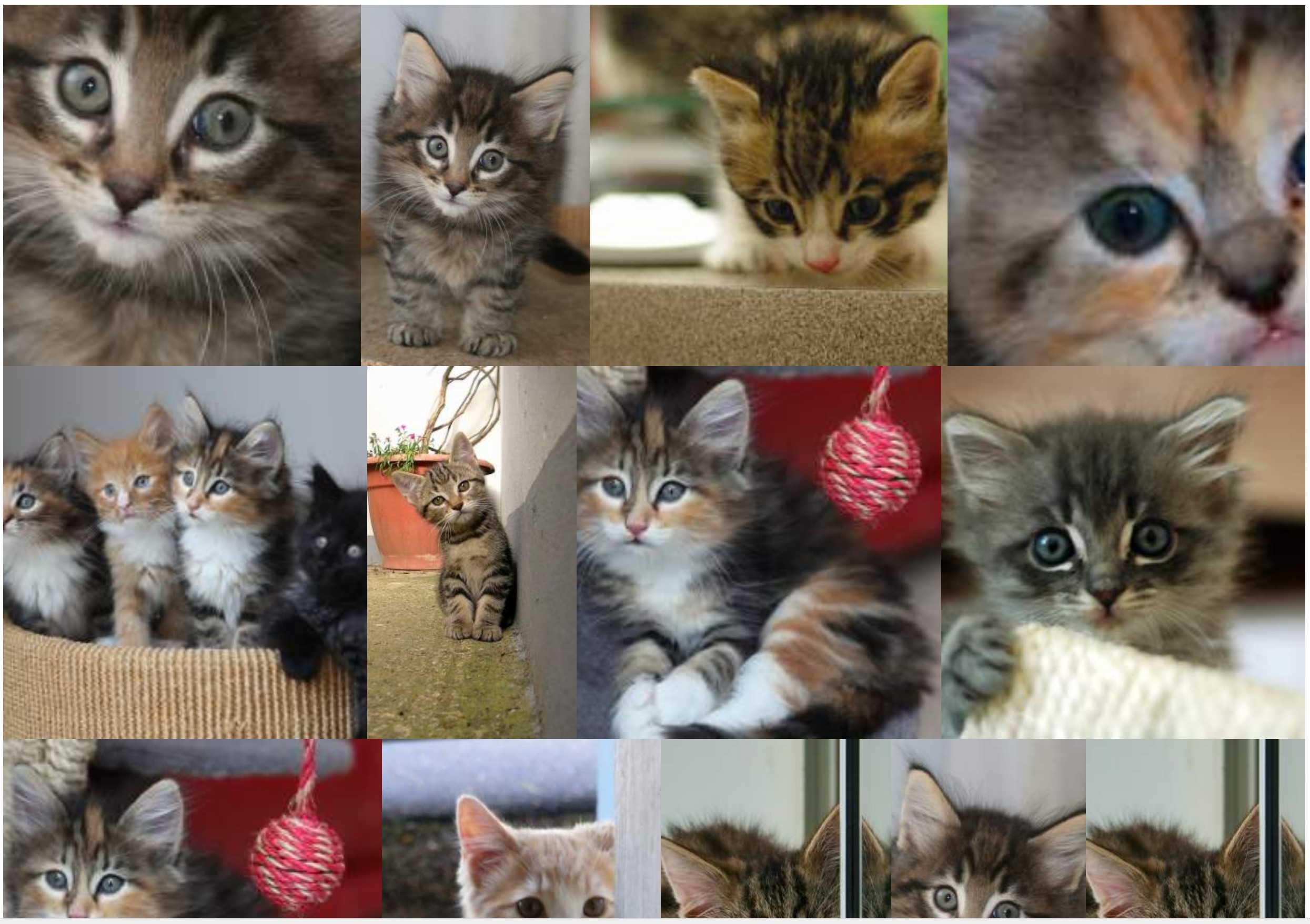
การแสดงแกลเลอรี่ภาพที่มีขนาดและสัดส่วนต่างกัน
- ไม่มีช่องว่าง (ระยะห่าง) ระหว่างรูปภาพ
- เคารพอัตราส่วนเดิมให้มากที่สุด
- รูปภาพล้อมรอบด้วยลิงค์
- โซลูชันที่ไม่ใช่ JS
- รูปภาพอาจถูกครอบตัดเล็กน้อย
- โซลูชันแบบพกพา
- ชุดของภาพที่แสดงเป็นแบบสุ่ม
- รูปภาพจะต้องแสดงจากซ้ายไปขวา (ป้องกันการใช้คอลัมน์)
ฉันประสบความสำเร็จด้วยโซลูชัน flexbox ต่อไปนี้:
section {
  display: flex;
  flex-flow: row wrap;
  justify-content: center;
}
section a {
  flex: auto;
}
section img {
  height: 100%;
  width: 100%;
  object-fit: cover;
}
<!DOCTYPE html>
<html lang="en">
<head>
    <title>Controlling flex growability</title>
    <meta name="viewport" content="width=device-width,initial-scale=1">
    <style>

    </style>
</head>
<body>
    <section>
        <a href="#"><img src="https://placekitten.com/400/195" width="400" height="195" alt="Kitty"></a>
        <a href="#"><img src="https://placekitten.com/256/400" width="256" height="400" alt="Kitty"></a>
        <a href="#"><img src="https://placekitten.com/400/237" width="400" height="237" alt="Kitty"></a>
        <a href="#"><img src="https://placekitten.com/400/111" width="400" height="111" alt="Kitty"></a>
        <a href="#"><img src="https://placekitten.com/400/245" width="400" height="245" alt="Kitty"></a>
        <a href="#"><img src="https://placekitten.com/400/227" width="400" height="227" alt="Kitty"></a>
        <a href="#"><img src="https://placekitten.com/250/400" width="250" height="400" alt="Kitty"></a>
        <a href="#"><img src="https://placekitten.com/400/269" width="400" height="269" alt="Kitty"></a>
        <a href="#"><img src="https://placekitten.com/400/255" width="400" height="255" alt="Kitty"></a>
        <a href="#"><img src="https://placekitten.com/288/400" width="288" height="400" alt="Kitty"></a>
        <a href="#"><img src="https://placekitten.com/234/400" width="234" height="400" alt="Kitty"></a>
        <a href="#"><img src="https://placekitten.com/194/400" width="194" height="400" alt="Kitty"></a>
        <a href="#"><img src="https://placekitten.com/222/400" width="222" height="400" alt="Kitty"></a>
        <a href="#"><img src="https://placekitten.com/400/227" width="400" height="227" alt="Kitty"></a>
        <a href="#"><img src="https://placekitten.com/192/400" width="192" height="400" alt="Kitty"></a>
        <a href="#"><img src="https://placekitten.com/400/141" width="400" height="141" alt="Kitty"></a>
        <a href="#"><img src="https://placekitten.com/400/289" width="400" height="289" alt="Kitty"></a>
        <a href="#"><img src="https://placekitten.com/400/255" width="400" height="255" alt="Kitty"></a>
        <a href="#"><img src="https://placekitten.com/210/400" width="210" height="400" alt="Kitty"></a>
        <a href="#"><img src="https://placekitten.com/400/187" width="400" height="187" alt="Kitty"></a>
    </section>
</body>
</html>
วิธีแก้ปัญหาใช้งานได้ แต่ขึ้นอยู่กับขนาดของหน้าต่างรูปภาพบางภาพมีขนาดใหญ่เกินไปฉันต้องการองค์ประกอบมากขึ้นต่อแถวแม้ว่ารายการจะต้องมีการหดตัวมากขึ้น
ซึ่งหมายความว่าแทน:
ฉันต้องการรายการที่มีความหนาแน่นสูงกว่าเพื่อที่ภาพจะไม่ขยายใหญ่ขึ้น
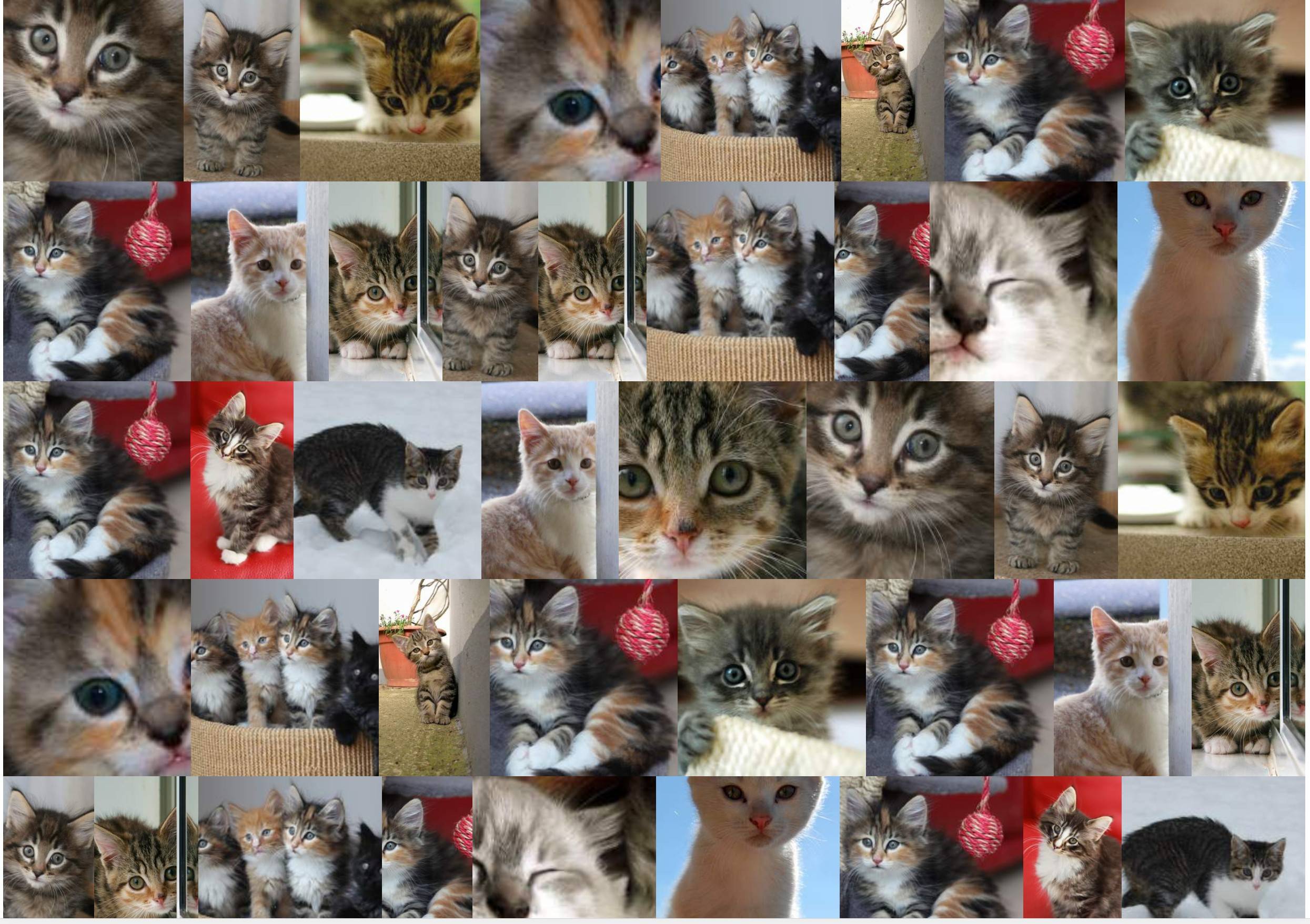
ฉันค้นหาวิธีแก้ไขเพื่อเพิ่มจำนวนองค์ประกอบต่อแถวทั่วโลกเพื่อให้ภาพไม่ได้รับการขยาย (หรืออย่างน้อยก็ไม่มากเกินไป: เช่น: 10% สูงสุด)
โซลูชันแฮ็กสองตัวที่ฉันได้พบคือ:
โซลูชันที่ 1
การใช้คุณสมบัติซูม :
section {
  display: flex;
  flex-flow: row wrap;
  justify-content: center;
  zoom: 50%;
}
section a {
  flex: auto;
}
section img {
  height: 100%;
  width: 100%;
  object-fit: cover;
}
<!DOCTYPE html>
<html lang="en">
<head>
    <title>Controlling flex growability</title>
    <meta name="viewport" content="width=device-width,initial-scale=1">
    <style>

    </style>
</head>
<body>
    <section>
        <a href="#"><img src="https://placekitten.com/400/195" width="400" height="195" alt="Kitty"></a>
        <a href="#"><img src="https://placekitten.com/256/400" width="256" height="400" alt="Kitty"></a>
        <a href="#"><img src="https://placekitten.com/400/237" width="400" height="237" alt="Kitty"></a>
        <a href="#"><img src="https://placekitten.com/400/111" width="400" height="111" alt="Kitty"></a>
        <a href="#"><img src="https://placekitten.com/400/245" width="400" height="245" alt="Kitty"></a>
        <a href="#"><img src="https://placekitten.com/400/227" width="400" height="227" alt="Kitty"></a>
        <a href="#"><img src="https://placekitten.com/250/400" width="250" height="400" alt="Kitty"></a>
        <a href="#"><img src="https://placekitten.com/400/269" width="400" height="269" alt="Kitty"></a>
        <a href="#"><img src="https://placekitten.com/400/255" width="400" height="255" alt="Kitty"></a>
        <a href="#"><img src="https://placekitten.com/288/400" width="288" height="400" alt="Kitty"></a>
        <a href="#"><img src="https://placekitten.com/234/400" width="234" height="400" alt="Kitty"></a>
        <a href="#"><img src="https://placekitten.com/194/400" width="194" height="400" alt="Kitty"></a>
        <a href="#"><img src="https://placekitten.com/222/400" width="222" height="400" alt="Kitty"></a>
        <a href="#"><img src="https://placekitten.com/400/227" width="400" height="227" alt="Kitty"></a>
        <a href="#"><img src="https://placekitten.com/192/400" width="192" height="400" alt="Kitty"></a>
        <a href="#"><img src="https://placekitten.com/400/141" width="400" height="141" alt="Kitty"></a>
        <a href="#"><img src="https://placekitten.com/400/289" width="400" height="289" alt="Kitty"></a>
        <a href="#"><img src="https://placekitten.com/400/255" width="400" height="255" alt="Kitty"></a>
        <a href="#"><img src="https://placekitten.com/210/400" width="210" height="400" alt="Kitty"></a>
        <a href="#"><img src="https://placekitten.com/400/187" width="400" height="187" alt="Kitty"></a>
    </section>
</body>
</html>
แต่คุณสมบัตินั้นใช้งานได้ดีใน Chrome ไม่ใช่ใน Firefox
โซลูชันที่ 2
การจำลองคุณสมบัติการซูมด้วยความกว้าง / ความสูงและการแปลง: สเกล :
section {
  display: flex;
  flex-flow: row wrap;
  justify-content: center;
  width: 200% !important;
  height: 200% !important;
  transform-origin: 0 0;
  transform: scale(0.5);
  float: left;
  margin-right: -100000px;
  margin-bottom: -100000px;
}
section a {
  flex: auto;
}
section img {
  height: 100%;
  width: 100%;
  object-fit: cover;
}
<!DOCTYPE html>
<html lang="en">
<head>
    <title>Controlling flex growability</title>
    <meta name="viewport" content="width=device-width,initial-scale=1">
    <style>

    </style>
</head>
<body>
    <section>
        <a href="#"><img src="https://placekitten.com/400/195" width="400" height="195" alt="Kitty"></a>
        <a href="#"><img src="https://placekitten.com/256/400" width="256" height="400" alt="Kitty"></a>
        <a href="#"><img src="https://placekitten.com/400/237" width="400" height="237" alt="Kitty"></a>
        <a href="#"><img src="https://placekitten.com/400/111" width="400" height="111" alt="Kitty"></a>
        <a href="#"><img src="https://placekitten.com/400/245" width="400" height="245" alt="Kitty"></a>
        <a href="#"><img src="https://placekitten.com/400/227" width="400" height="227" alt="Kitty"></a>
        <a href="#"><img src="https://placekitten.com/250/400" width="250" height="400" alt="Kitty"></a>
        <a href="#"><img src="https://placekitten.com/400/269" width="400" height="269" alt="Kitty"></a>
        <a href="#"><img src="https://placekitten.com/400/255" width="400" height="255" alt="Kitty"></a>
        <a href="#"><img src="https://placekitten.com/288/400" width="288" height="400" alt="Kitty"></a>
        <a href="#"><img src="https://placekitten.com/234/400" width="234" height="400" alt="Kitty"></a>
        <a href="#"><img src="https://placekitten.com/194/400" width="194" height="400" alt="Kitty"></a>
        <a href="#"><img src="https://placekitten.com/222/400" width="222" height="400" alt="Kitty"></a>
        <a href="#"><img src="https://placekitten.com/400/227" width="400" height="227" alt="Kitty"></a>
        <a href="#"><img src="https://placekitten.com/192/400" width="192" height="400" alt="Kitty"></a>
        <a href="#"><img src="https://placekitten.com/400/141" width="400" height="141" alt="Kitty"></a>
        <a href="#"><img src="https://placekitten.com/400/289" width="400" height="289" alt="Kitty"></a>
        <a href="#"><img src="https://placekitten.com/400/255" width="400" height="255" alt="Kitty"></a>
        <a href="#"><img src="https://placekitten.com/210/400" width="210" height="400" alt="Kitty"></a>
        <a href="#"><img src="https://placekitten.com/400/187" width="400" height="187" alt="Kitty"></a>
    </section>
</body>
</html>
วิธีการแก้ปัญหานั้นใช้งานได้ไกล แต่ต้องการแฮ็กเพียงเล็กน้อยและอยู่ไกลจากความสง่างามและตอนนี้จะมีผลกระทบกับองค์ประกอบอื่น ๆ ของหน้าเว็บ
มีวิธีแก้ปัญหาอื่น ๆ ที่มุ่งเน้นความยืดหยุ่นมากกว่าที่อนุญาตการควบคุมแบบนั้นหรือไม่? ฉันได้ลองใช้flex-grow: 0 : แน่นอนปิดการใช้งานรายการที่กำลังเติบโต แต่แล้วมีช่องว่างรอบภาพทุกที่
zoomเพราะมันจะแก้ไขแถวทั้งหมดให้มีความสูงเท่ากันโดยการทำเช่นนี้: มันจะป้องกันอัลกอริทึมแบบยืดหยุ่นตามธรรมชาติเพื่อ "ปรับ" ให้เข้ากับบางสิ่ง "ที่สุดเท่าที่จะทำได้" เท่าที่ฉันเข้าใจยังไม่สามารถบรรลุสิ่งที่ฉันต้องการในวิธีที่เข้ากันได้และไม่แฮ็ค