CSS text-overflow ในเซลล์ตารางหรือไม่?


500

ฉันต้องการใช้ CSS text-overflowในเซลล์ตารางเช่นหากข้อความยาวเกินกว่าจะใส่ลงในหนึ่งบรรทัดได้ก็จะตัดด้วยจุดไข่ปลาแทนการพันเป็นหลายบรรทัด เป็นไปได้ไหม

ฉันลองสิ่งนี้:

td {
  overflow: hidden;
  text-overflow: ellipsis;
  white-space: nowrap;
}

แต่white-space: nowrapดูเหมือนว่าจะทำให้ข้อความ (และเซลล์ของมัน) ขยายออกไปทางขวาอย่างต่อเนื่องผลักดันความกว้างทั้งหมดของตารางเกินความกว้างของภาชนะ อย่างไรก็ตามหากไม่มีข้อความจะยังคงพันบรรทัดต่อเมื่อถึงขอบของเซลล์


9
เซลล์ของตารางไม่สามารถจัดการได้overflowดี ลองวาง div ในเซลล์และจัดแต่งทรงผมที่ div
Mr Lister

คำตอบ:


898

เมื่อต้องการคลิปข้อความด้วยจุดไข่ปลาเมื่อมีการล้นเซลล์ตารางคุณจะต้องตั้งค่าmax-widthคุณสมบัติ CSS ในแต่ละtdคลาสเพื่อให้โอเวอร์โฟลว์ทำงานได้ ไม่จำเป็นต้องมีเค้าโครงของ div เพิ่มเติม

td {
    max-width: 100px;
    overflow: hidden;
    text-overflow: ellipsis;
    white-space: nowrap;
}

สำหรับเลย์เอาต์ตอบสนอง; ใช้max-widthคุณสมบัติ CSS เพื่อระบุความกว้างขั้นต่ำที่มีประสิทธิภาพของคอลัมน์หรือเพียงใช้max-width: 0;เพื่อความยืดหยุ่นที่ไม่ จำกัด นอกจากนี้ตารางที่มีจะต้องมีความกว้างที่เฉพาะเจาะจงโดยทั่วไปแล้วwidth: 100%;คอลัมน์จะมีการตั้งค่าความกว้างเป็นเปอร์เซ็นต์ของความกว้างทั้งหมด

table {
    width: 100%;
}
td {
    max-width: 0;
    overflow: hidden;
    text-overflow: ellipsis;
    white-space: nowrap;
}
td.columnA {
    width: 30%;
}
td.columnB {
    width: 70%;
}

ประวัติ: สำหรับ IE 9 (หรือน้อยกว่า) คุณต้องมีสิ่งนี้ใน HTML ของคุณเพื่อแก้ไขปัญหาการเรนเดอร์เฉพาะ IE

<!--[if IE]>
<style>
    table {
        table-layout: fixed;
        width: 100px;
    }
</style>
<![endif]-->

7
ตารางยังต้องการความกว้างสำหรับการทำงานใน IE jsfiddle.net/rBthS/69
Trevor Dixon

1
หากคุณตั้งค่าwidth: 100%;และmin-width: 1px;เซลล์จะกว้างที่สุดเท่าที่จะเป็นไปได้เสมอและจะใช้จุดไข่ปลาเพื่อตัดทอนข้อความเมื่อต้องการ (ไม่ใช่เมื่อความกว้างขององค์ประกอบกระทบกับขนาดที่กำหนด) - สิ่งนี้มีประโยชน์มากสำหรับเค้าโครงที่ตอบสนอง
Duncan Walker

2
@OzrenTkalcecKrznaric ใช้งานได้display: table-cellจริง แต่ไม่ใช่เมื่อmax-widthกำหนดไว้เป็นเปอร์เซ็นต์ (%) ทดสอบใน FF 32
Greg

14
(ติดตามข้างต้น) ในกรณีที่คุณใช้ค่า% แล้วเพียงแค่ใช้table-layout: fixedในองค์ประกอบที่มีdisplay: tableจะทำเคล็ดลับ
เกร็ก

1
ถ้าคุณต้องการความกว้างของคอลัมน์ที่จะถูกกำหนดโดยอัตโนมัติในรูปแบบการตอบสนองเช่นตารางการตอบสนอง bootstrap? การตั้งค่าความกว้างสูงสุดจะก้าวก่ายในเรื่องนั้น มีวิธีแก้ปัญหาหรือไม่?
ทำรัง

81

การระบุ a max-widthหรือความกว้างคงที่นั้นไม่สามารถใช้ได้กับทุกสถานการณ์และตารางควรเป็นของเหลวและเว้นวรรคเซลล์ของมันโดยอัตโนมัติ นั่นคือสิ่งที่ตารางมีไว้สำหรับ

ใช้สิ่งนี้: http://jsfiddle.net/maruxa1j/

HTML:

<td class="ellipsis">
    <span>This Text Overflows and is too large for its cell.</span>
</td>

CSS:

.ellipsis {
    position: relative;
}
.ellipsis:before {
    content: '&nbsp;';
    visibility: hidden;
}
.ellipsis span {
    position: absolute;
    left: 0;
    right: 0;
    white-space: nowrap;
    overflow: hidden;
    text-overflow: ellipsis;
}

ทำงานบน IE9 และเบราว์เซอร์อื่น ๆ


หมายเหตุ: โซลูชันนี้ล้อมเนื้อหาเซลล์ใน<span>องค์ประกอบ
Roy Tinker

2
นี่เป็นทางออกที่ฉลาดจริงๆและใช้ได้ดีสำหรับทุกตารางที่ฉันต้องการวิธีแก้ปัญหา อย่างไรก็ตามคุณต้องกำหนดความกว้างหากคุณไม่ต้องการให้เซลล์ตารางทั้งหมดมีความกว้างเท่ากัน
Kevin Beal

เมื่อไม่มีความกว้างคงที่โซลูชันนี้จะทำงานได้ดีที่สุด ฉลาดมากแน่นอน!
avidenic

1
สิ่งนี้จะช่วยให้การจัดตำแหน่งแนวตั้งเมื่อวิธีการแก้ปัญหาอื่น ๆ เช่นdisplay: blockไม่ได้
j3ff

ทางออกที่ดีที่สุด! ค่อนข้างฉลาด ขอบคุณมาก.
ClownCoder

39

ทำไมสิ่งนี้ถึงเกิดขึ้น

ดูเหมือนว่าส่วนนี้ใน w3.orgชี้ให้เห็นว่าการใช้ข้อความมากเกินจะใช้ได้เฉพาะกับองค์ประกอบบล็อก :

11.1.  Overflow Ellipsis: the ‘text-overflow’ property

text-overflow      clip | ellipsis | <string>  
Initial:           clip   
APPLIES TO:        BLOCK CONTAINERS               <<<<
Inherited:         no  
Percentages:       N/A  
Media:             visual  
Computed value:    as specified  

MDN กล่าวว่าเดียวกัน

นี้jsfiddleมีรหัสของคุณ (ที่มีการปรับเปลี่ยนการแก้ปัญหาไม่กี่) ซึ่งทำงานได้ดีถ้ามันนำไปใช้แทนdiv tdนอกจากนี้ยังมีวิธีแก้ปัญหาเดียวที่ฉันสามารถนึกได้อย่างรวดเร็วด้วยการห่อเนื้อหาของtdในdivบล็อกที่มี อย่างไรก็ตามดูเหมือนว่ามาร์กอัป "น่าเกลียด" สำหรับฉันดังนั้นฉันหวังว่าคนอื่นจะมีทางออกที่ดีกว่า รหัสสำหรับทดสอบนี้มีลักษณะดังนี้:

td, div {
  overflow: hidden;
  text-overflow: ellipsis;
  white-space: nowrap;
  border: 1px solid red;
  width: 80px;
}
Works, but no tables anymore:
<div>Lorem ipsum and dim sum yeah yeah yeah. Lorem ipsum and dim sum yeah yeah yeah. Lorem ipsum and dim sum yeah yeah yeah. Lorem ipsum and dim sum yeah yeah yeah. Lorem ipsum and dim sum yeah yeah yeah.</div>

Works, but non-semantic markup required:
<table><tr><td><div>Lorem ipsum and dim sum yeah yeah yeah. Lorem ipsum and dim sum yeah yeah yeah. Lorem ipsum and dim sum yeah yeah yeah. Lorem ipsum and dim sum yeah yeah yeah. Lorem ipsum and dim sum yeah yeah yeah.</div></td></tr></table>


2
ขอบคุณมาก ฉันไม่สามารถลบเซลล์ตารางออกจากมาร์กอัปของฉันได้ดังนั้นฉันจึงห่อเนื้อหาใน divs (โดยตั้งค่าความกว้างเป็นความกว้างของเซลล์) และใช้การโอเวอร์โฟลว์ที่นั่นแทน ทำงานเหมือนจับใจ!
daGUY

28

ในกรณีที่คุณไม่ต้องการตั้งค่าความกว้างคงที่เป็นอะไร

วิธีแก้ปัญหาด้านล่างช่วยให้คุณมีเนื้อหาของเซลล์ตารางที่มีความยาว แต่จะต้องไม่ส่งผลกระทบต่อความกว้างของตารางหลักหรือความสูงของแถวหลัก ตัวอย่างเช่นที่คุณต้องการมีตารางwidth:100%ที่ยังคงใช้คุณสมบัติขนาดอัตโนมัติกับเซลล์อื่นทั้งหมด มีประโยชน์ในกริดข้อมูลที่มีคอลัมน์ "หมายเหตุ" หรือ "ความคิดเห็น" หรือบางสิ่งบางอย่าง

ป้อนคำอธิบายรูปภาพที่นี่

เพิ่ม 3 กฎเหล่านี้ลงใน CSS ของคุณ:

.text-overflow-dynamic-container {
    position: relative;
    max-width: 100%;
    padding: 0 !important;
    display: -webkit-flex;
    display: -moz-flex;
    display: flex;
    vertical-align: text-bottom !important;
}
.text-overflow-dynamic-ellipsis {
    position: absolute;
    white-space: nowrap;
    overflow-y: visible;
    overflow-x: hidden;
    text-overflow: ellipsis;
    -ms-text-overflow: ellipsis;
    -o-text-overflow: ellipsis;
    max-width: 100%;
    min-width: 0;
    width:100%;
    top: 0;
    left: 0;
}
.text-overflow-dynamic-container:after,
.text-overflow-dynamic-ellipsis:after {
    content: '-';
    display: inline;
    visibility: hidden;
    width: 0;
}

จัดรูปแบบ HTML เช่นนี้ในเซลล์ตารางใด ๆ ที่คุณต้องการโอเวอร์โฟลว์ข้อความแบบไดนามิก:

<td>
  <span class="text-overflow-dynamic-container">
    <span class="text-overflow-dynamic-ellipsis" title="...your text again for usability...">
      //...your long text here...
    </span>
  </span>
</td>

นอกจากนี้ต้องการใช้ min-width (หรือไม่มีเลย) กับเซลล์ตาราง

แน่นอนซอ: https://jsfiddle.net/9wycg99v/23/


คำตอบที่มีประโยชน์ที่สุดจุดไข่ปลาแบบไดนามิกนั้นยอดเยี่ยมมาก
lucifer63

มันทำให้เกิดข้อจำกัดความกว้างที่เลือกของทุกคอลัมน์เช่นหากคุณมีบางคอลัมน์ที่กำหนดไว้สำหรับmax-width: Xตอนนี้พวกเขาสามารถกว้างขึ้นได้ - ฉันคิดว่านี่เป็นเพราะdisplay: flexมีการใช้งาน แต่ฉันลบออกแล้วและไม่เห็นความแตกต่าง ...
user9645

24

ดูเหมือนว่าถ้าคุณระบุtable-layout: fixed;ในtableองค์ประกอบแล้วสไตล์ของคุณสำหรับtdจะมีผล สิ่งนี้จะส่งผลต่อขนาดของเซลล์ด้วย

Sitepoint อธิบายวิธีการจัดวางตารางเล็กน้อยที่นี่: http://reference.sitepoint.com/css/tableformatting


2
นี่ควรเป็นคำตอบที่ถูกต้องเมื่อคุณไม่ต้องการระบุความกว้างของตาราง
adriaan

20

หากคุณต้องการให้ตารางจัดเลย์เอาต์อัตโนมัติ

โดยไม่ใช้max-widthหรือเปอร์เซ็นต์ความกว้างคอลัมน์หรือtable-layout: fixedอื่น ๆ

https://jsfiddle.net/tturadqq/

มันทำงานอย่างไร:


ขั้นตอนที่ 1: เพียงให้ตารางเลย์เอาต์อัตโนมัติทำสิ่งนั้น

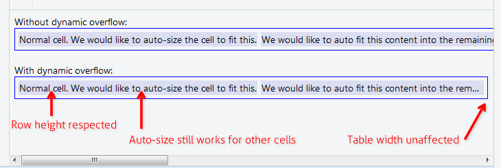
เมื่อมีหนึ่งหรือหลายคอลัมน์ที่มีข้อความจำนวนมากมันจะย่อขนาดคอลัมน์อื่นให้มากที่สุดเท่าที่จะเป็นไปได้จากนั้นจึงตัดข้อความของคอลัมน์ที่มีความยาว:

ป้อนคำอธิบายรูปภาพที่นี่


ขั้นตอนที่ 2: ล้อมเนื้อหาเซลล์ใน div จากนั้นตั้งค่า div ให้เป็น max-height: 1.1em

(0.1em พิเศษสำหรับตัวละครที่ทำให้ต่ำกว่าฐานข้อความเช่นหางของ 'g' และ 'y')

ป้อนคำอธิบายรูปภาพที่นี่


ขั้นตอนที่ 3: ตั้งค่าtitleบน divs

นี่เป็นสิ่งที่ดีสำหรับการเข้าถึงและเป็นสิ่งจำเป็นสำหรับเคล็ดลับเล็ก ๆ น้อย ๆ ที่เราจะใช้ในช่วงเวลาหนึ่ง

ป้อนคำอธิบายรูปภาพที่นี่


ขั้นตอนที่ 4: เพิ่ม CSS ::afterบน div

นี่เป็นบิตที่ยุ่งยาก เราตั้ง CSS เมื่อคุณ::afterมีcontent: attr(title)ตำแหน่งแล้วที่ด้านบนของ div text-overflow: ellipsisและการตั้งค่า ฉันวาดสีแดงที่นี่เพื่อให้ชัดเจน

(โปรดสังเกตว่าคอลัมน์ที่มีความยาวในตอนนี้มีจุดไข่ปลาหาง)

ป้อนคำอธิบายรูปภาพที่นี่


ขั้นตอนที่ 5: ตั้งค่าสีของข้อความ div เป็น transparent

และเราทำเสร็จแล้ว!

ป้อนคำอธิบายรูปภาพที่นี่


2
นี่เป็นทางออกที่ยอดเยี่ยมและสมบูรณ์แบบ! ฉันสงสัยว่าทำไมสิ่งนี้ถึงได้รับการลงคะแนนเชิงลบแทนผู้โหวตมากที่สุด !!
zendu

2
สุดยอดมนุษย์! (@ user9645 - ไม่ถูกต้อง: ให้มันทำงานกับตารางที่แสดงผลด้วย Vue.js - อย่าลืมใส่ชื่อลงใน div ไม่ใช่บน the td's)
Christian Opitz

@ChristianOpitz - ใช่ฉันต้องทำให้มันยุ่งเหยิงอย่างใด ... ลองใหม่อีกครั้งและมันก็ใช้งานได้
user9645

ฉันสังเกตว่าวิธีนี้ล้มเหลวเมื่อใช้<a>แทน<div>เซลล์ตารางภายใน การเพิ่มword-break: break-all;แก้ปัญหา ตัวอย่าง: jsfiddle.net/de0bjmqv
zendu

ดีเพียง. และคุณไม่จำเป็นต้องมีข้อความเดียวกันในเซลล์ (ชื่อเรื่องก็เพียงพอแล้ว) และคุณไม่จำเป็นต้องมีความสูงสูงสุด: 1.1em เป็นต้น - ทั้งหมดที่คุณต้องการสำหรับ div คือตำแหน่ง: สัมพัทธ์;
KS74

13

เมื่ออยู่ในความกว้างตารางเปอร์เซ็นต์หรือคุณไม่สามารถกำหนดความกว้างคงที่ในเซลล์ตารางได้ คุณสามารถสมัครtable-layout: fixed;เพื่อให้มันใช้ได้

table {
  table-layout: fixed;
  width: 100%;
}
td {
  text-overflow: ellipsis;
  white-space: nowrap;
  overflow: hidden;
  border: 1px solid red;
}
<table>
  <tr>
    <td>Lorem ipsum and dim sum yeah yeah yeah. Lorem ipsum and dim sum yeah yeah yeah. Lorem ipsum and dim sum yeah yeah yeah. Lorem ipsum and dim sum yeah yeah yeah. Lorem ipsum and dim sum yeah yeah yeah.</td>
    <td>Lorem ipsum and dim sum yeah yeah yeah. Lorem ipsum and dim sum yeah yeah yeah. Lorem ipsum and dim sum yeah yeah yeah. Lorem ipsum and dim sum yeah yeah yeah. Lorem ipsum and dim sum yeah yeah yeah.</td>
  </tr>
</table>


5

ล้อมเนื้อหาเซลล์ในบล็อกแบบยืดหยุ่น เป็นโบนัสเซลล์อัตโนมัติเหมาะกับความกว้างที่มองเห็นได้

table {
  width: 100%;
}

div.parent {
  display: flex;
}

div.child {
  flex: 1;
  width: 1px;
  overflow-x: hidden;
  text-overflow: ellipsis;
}
<table>
  <tr>
    <td>
      <div class="parent">
        <div class="child">
          xxxxxxxxxxxxxxxxxxxxxxxxxxxxxxxxxxxxxxxxxxxxxxxxxxxxxxxxxxxxxxxxxxxxxxxxxxxxxxxxxxxxxxxxxxxxxxxxxxxxxxxxxxxxxxxxxxxxxxxxxxxxxxxxxxxxxxxxxxxxxxxxxxxxxxxxxxxxxxxxxxxxxxxxxxxxxxxxxxxxxxxxxxxxxxxxxxxxxxxxxxxxxxxxxxxxxxxxxxxxxxxxxxxxxxxxxxxxxxxxxxxxxxxxxxxxxxxxxxxxxxxxxxxxxxxxxxxxxxxxxxxxxxxxxxxxxxxxxxxxxxxxxxxxxxxxxxxxxxxxxxxxxxxxxxxxxxxxxxxxxxxxxxxxxxxxxxxxxxxxxxxxxxxxxxxxxxxxxxxxxxxxxxxxxxxxxxxxxxxxxxxxxxxxxxxxxxxxxxxxxxxxxxxxxxxxxxxxxxxxxxxxxxxxxxxxxxxxxxxxxxxxxxxxxxxxxxxxxxxxxxxxxxxxxxxxxxxxxxxxxxxxxxxxxxxxxxxxxxxxxxxxxxxxxxxxxxxxxxxxxxxxxxxxxxxxxxxxxxxxxxxxxxxxxxxxxxxxxxxxxxxxxxxxxxxxxxxx
        </div>
      <div>
    </td>
  </tr>
</table>


3
ฉันต้องเพิ่มwhite-space: nowrap;ในchildชั้นเรียนด้วย
Ross Allen

3

ฉันแก้ปัญหานี้โดยใช้ div ที่อยู่ในเซลล์

td {
    position: relative;
}
td > div {
    position: absolute;
    white-space: nowrap;
    overflow: hidden;
    text-overflow: ellipsis;
    max-width: 100%;        
}

แค่นั้นแหละ. จากนั้นคุณสามารถเพิ่ม top: value ให้กับ div หรือจัดกึ่งกลางในแนวตั้ง:

td > div {      
    top: 0;
    bottom: 0;
    margin: auto 0;
    height: 1.5em; // = line height 
}

เพื่อให้มีพื้นที่ด้านขวาคุณสามารถลดความกว้างสูงสุดได้เล็กน้อย


มันจะดีกับ JSFiddle เป็นคำตอบอื่น ๆ อีกมากมายสำหรับคำถามยอดนิยมนี้
oma

ใช่มันใช้งานได้ แต่ฉันใช้สไตล์ที่แตกต่างกันเล็กน้อยสำหรับ divs: left: 0; top: 0; right: 0; bottom: 0; padding: 2px; เพื่อให้ได้ตำแหน่งที่ถูกต้องและมีช่องว่างภายในเหมือนกับในเซลล์ของตาราง
KS74

0

สิ่งนี้ใช้ได้ในกรณีของฉันทั้งใน Firefox และ Chrome:

td {
  max-width: 0;
  overflow: hidden;
  text-overflow: ellipsis;
  white-space: nowrap;
  width: 100%;
}

-5

นี่คือรุ่นที่ใช้งานได้ใน IE 9

http://jsfiddle.net/s27gf2n8/

<div style="display:table; table-layout: fixed; width:100%; " >
        <div style="display:table-row;">
            <div style="display:table-cell;">
                <table style="width: 100%; table-layout: fixed;">
                    <div style="text-overflow:ellipsis;overflow:hidden;white-space:nowrap;">First row. Lorem Ipsum is simply dummy text of the printing and typesetting industry. Lorem Ipsum has been the industry's standard dummy text ever since the 1500s, when an unknown printer took a galley of type and scrambled it to make a type specimen book. It has survived not only five centuries, but also the leap into electronic typesetting, remaining essentially unchanged. It was popularised in the 1960s with the release of Letraset sheets containing Lorem Ipsum passages, and more recently with desktop publishing software like Aldus PageMaker including versions of Lorem Ipsum.</div>
                </table>
            </div>
            <div style="display:table-cell;">
                Top right Cell.
            </div>
        </div>
        <div style="display:table-row;">
            <div style="display:table-cell;">
                <table style="width: 100%; table-layout: fixed;">
                    <div style="text-overflow:ellipsis;overflow:hidden;white-space:nowrap;">Second row - Lorem Ipsum is simply dummy text of the printing and typesetting industry. Lorem Ipsum has been the industry's standard dummy text ever since the 1500s, when an unknown printer took a galley of type and scrambled it to make a type specimen book. It has survived not only five centuries, but also the leap into electronic typesetting, remaining essentially unchanged. It was popularised in the 1960s with the release of Letraset sheets containing Lorem Ipsum passages, and more recently with desktop publishing software like Aldus PageMaker including versions of Lorem Ipsum.</div>
                </table>
            </div>
            <div style="display:table-cell;">
                Bottom right cell.
            </div>
        </div>
    </div>

6
<div> ในฐานะลูกโดยตรงของ <table> หรือไม่ ดูเหมือนจะไม่ถูกต้อง!
Michiel

@michiel FYI - เบราว์เซอร์สามารถจัดการ Divs ด้านล่างแท็กตาราง
Ryan O'Connell
โดยการใช้ไซต์ของเรา หมายความว่าคุณได้อ่านและทำความเข้าใจนโยบายคุกกี้และนโยบายความเป็นส่วนตัวของเราแล้ว
Licensed under cc by-sa 3.0 with attribution required.